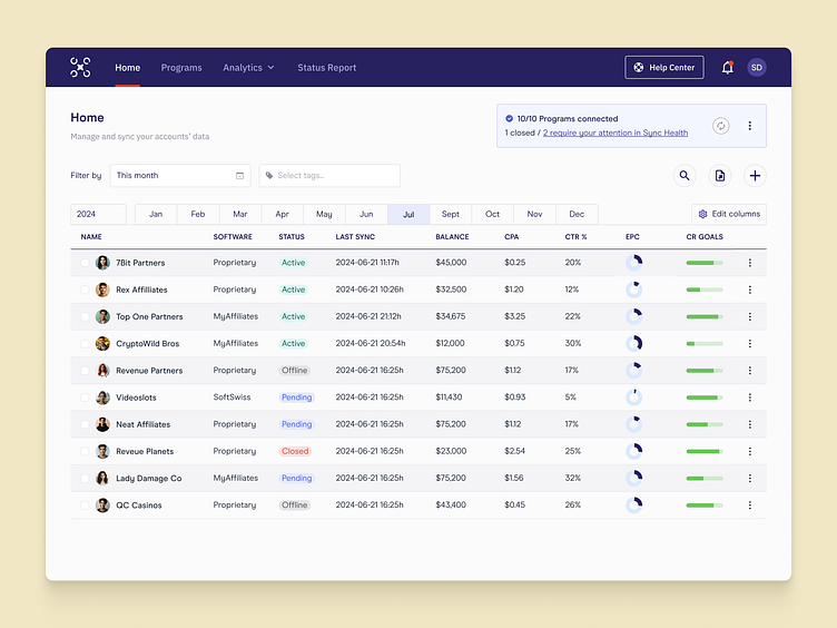
MarTech B2B SaaS Data Sync Table
The goal
Our client had an existing app that was dated and clunky UX-wise. Our goal was not only to implement best practices and a more modern design system, but to also include a. Syncing health check system right from their Homepage.
The challenge
Re-designing most of this page was easy enough - table, filtering, date range picker, actions... the tricky part came with the Syncing of the data. Up to this point, syncing was simply informative, with sometimes a large percentages of the accounts syncing incorrectly and leaving users with poor data and nothing to do. Working closely with stakeholders and devs we came up with this new Sync Health Center: data syncs as usual, but those accounts with issues were now "Conflicts to be resolved", giving users actions and insights for a more product-led, self serve UX.
The outcome
The outcome added a ton of value to this main page: it's where users land to check on their vitals, how their accounts are doing, how much money they're making... not only are they now met with a sleek, sharp looking UI but they can also resolve any issues that occur during their data syncing and management.
What do you think? 👀
Work with us!
UserActive is a product design agency for B2B SaaS. We’re on a mission to help SaaS Founders create meaningful products users love.
Book a call 👉🏼 www.useractive.io
