UX/Art Direction, Design & QA of Sprint Homepage Redesign
The Ask
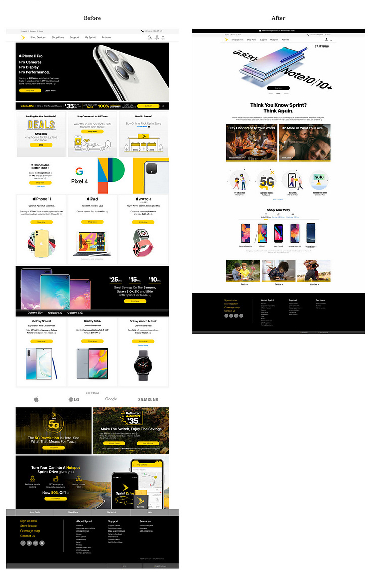
Take a cluttered, "deals, deals, deals!"-dominated homepage and minimalize it with our newly redesigned AEM (Adobe Experience Manager) components.
The Approach
Utilizing extensive research and user testing, we pushed beyond the ask to create what customers want to see from Sprint: a fresh design, approachability, humanity, authenticity, and transparency.
I straddled direction of visuals, UX, UI, production, and a hectic QA process 🫠 I also had to fight for things like micro-animations on the CTAs.
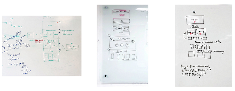
Testing
Through surveys, customers made it clear that they largely knew what they wanted when they arrived to Sprint.com; if they wanted the latest iPhone that's what they came for regardless of deals and if they were looking for a mid-tier smartphone they weren't going to be swayed by repeated iPhone promos.
To resolve do this, we utilized a structure that allows users to get right where they want to go, uncharacteristically bold messaging, fun illustrations, subtle hover animations, and photography that captures real people having real moments (with products and sometimes without).
We also took a step back to make sure the homepage answered key UX questions:
What we provide: Price, Network, Service, and Convenience
Why you should buy it
How you get it
We divided the page into sections to answer:
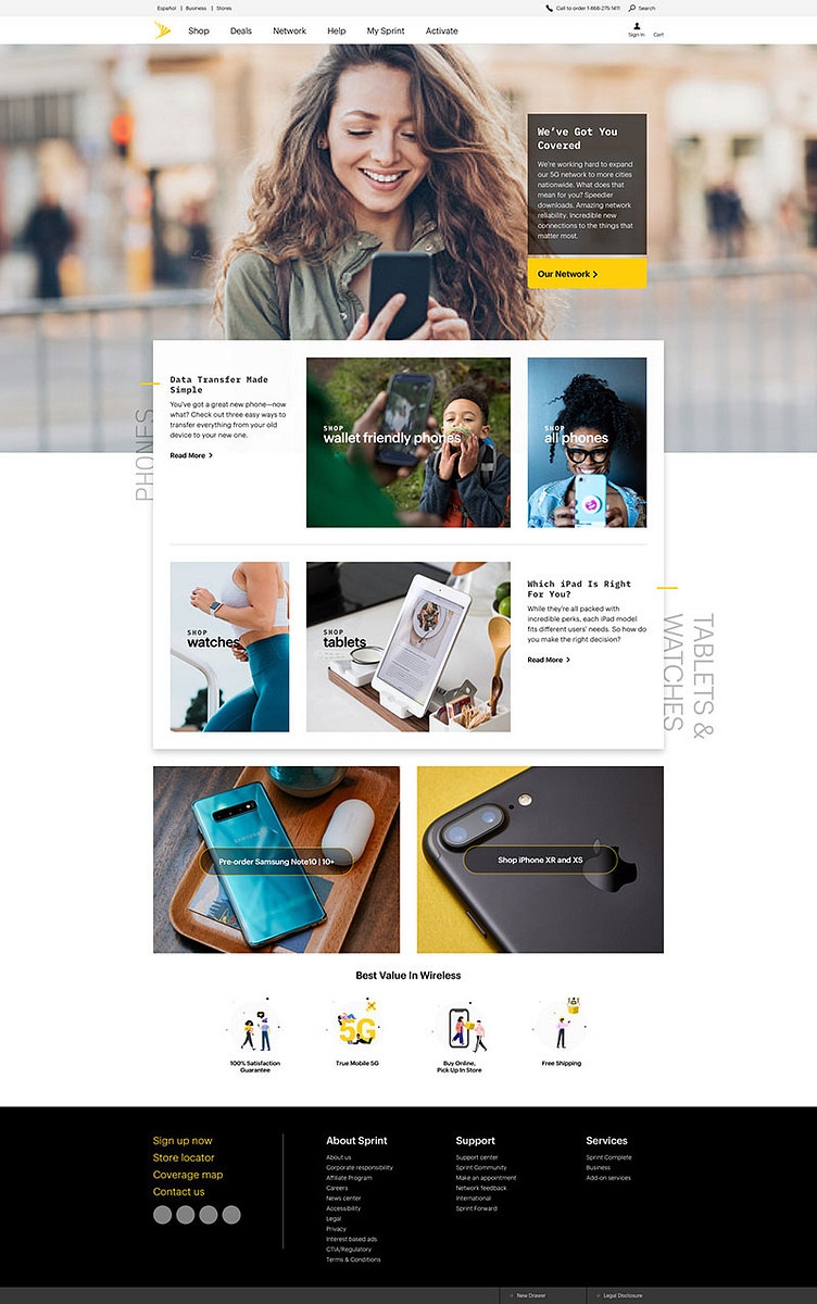
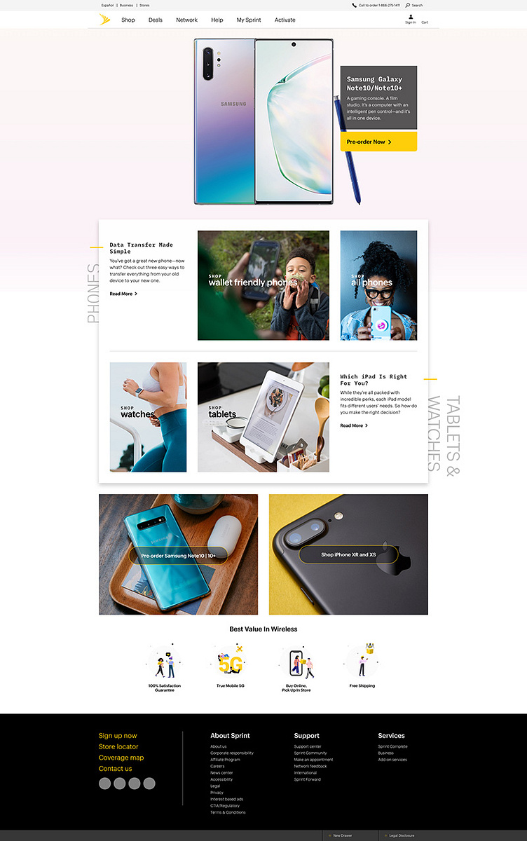
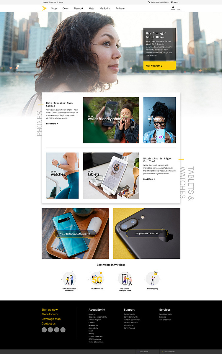
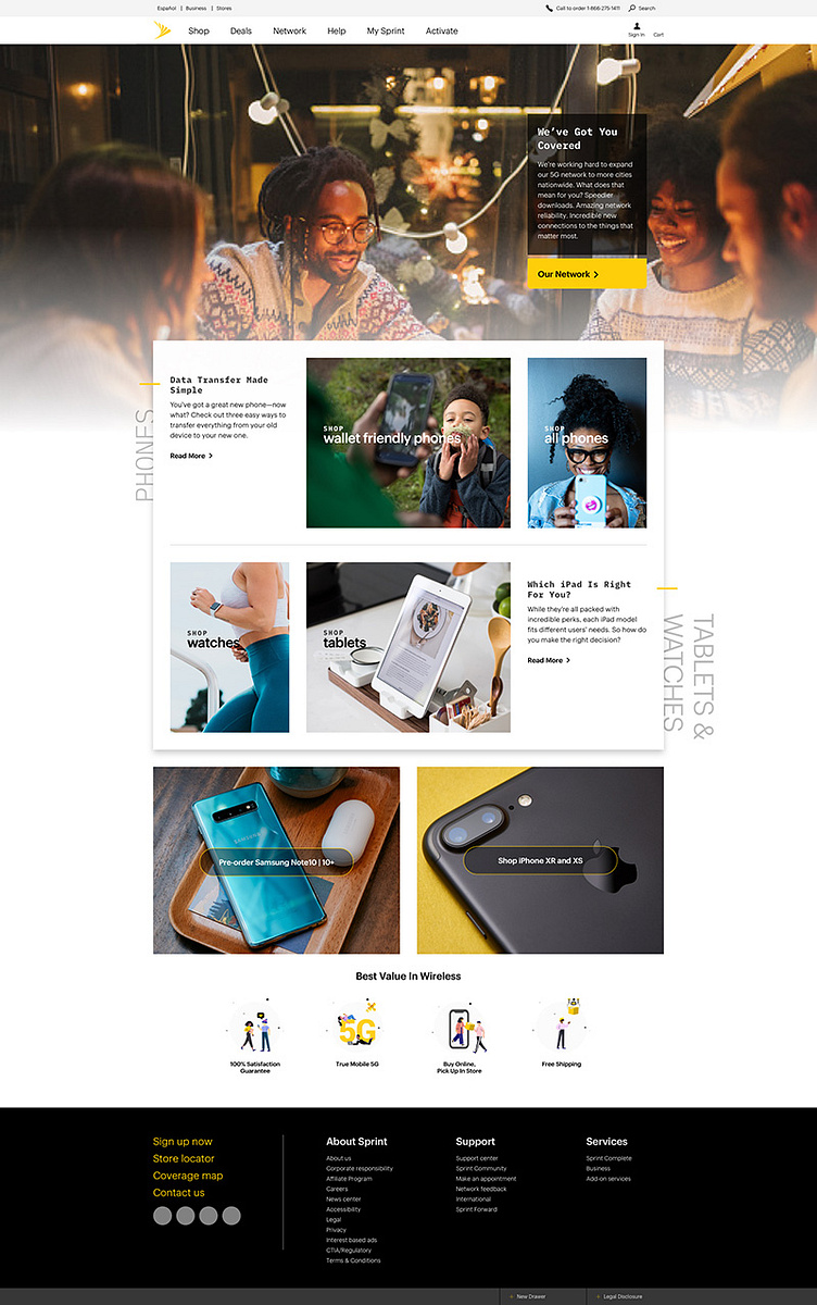
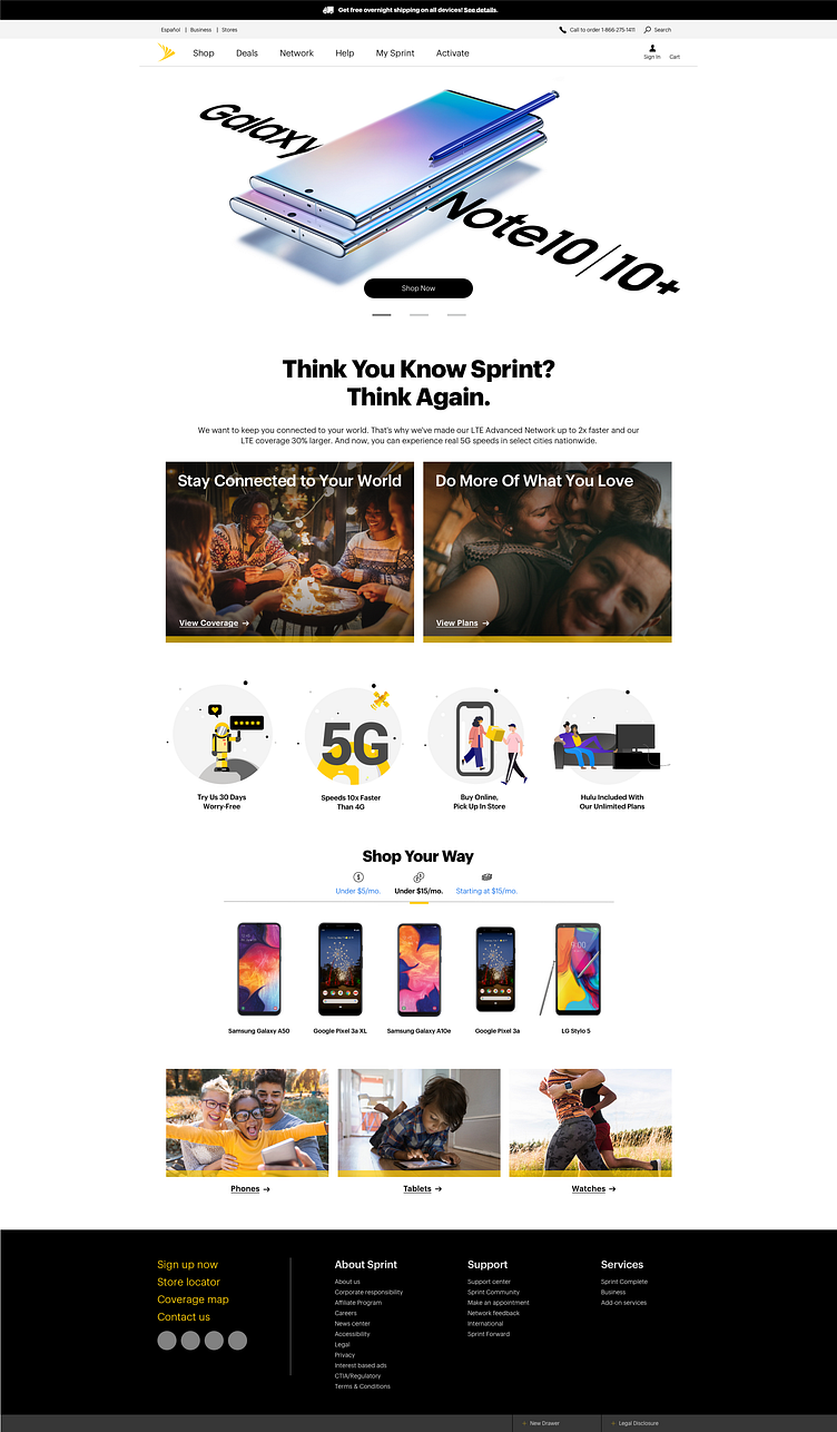
S1: Rotating (limit 3) - Iconic Devices
S2: Why - Network | Plans | 100% Guarantee | 5G | Buy Online, Pickup In-store | Hulu
S3: How - Tabbed Device Section
S4: Offers - Deals | Tablets | Wearables
The Results
The final creative below was one of three prototypes developed and presented to leadership (see another below). Additionally, we ran an A/B Test with our final version versus one with less text and taller blocks of imagery.
The cleanliness of the page architecture resulted in:
169.3%
increase in Black Friday conversions
22%
increase in overall conversions
18%
increase in overall product orders
We were able to turn this victory into restructuring the navigation as well.
A/B Test

Additional Concept
This first concept, nicknamed Ragnarok, was our most ambitious and futuristic. We figured if we can have everything we all spent years dreaming the Sprint site could be, let's try to implement it now! This version included content, such as help articles or curated pieces like our City Guide. We also imagined the header content would be home to large, inviting visuals focused on our network coverage, Iconic device pre-orders, and localized messaging -- which I had worked on for several 5G initiatives.