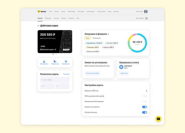
Debit card for "T-bank"
Hi Everyone! 👋
We developed an improved version of the "Cards" homepage design for T-bank. Read more here M&W.
What do you think about the page?
❗ This case is not commercial, it was made within the Fast Track program from Tinkoff by one of our designers. We in no way want to take credit for the bank, but only want to show what problems we know how to solve by the example of this case study
What did we do? 👜
Redesigned the original interface, making it clearer and easier to understand
Made the logo full-size for more memorability and branding in the eyes of customers
Made the top menu full size for more conversion of other services
Changed the color palette in "Card Transactions" by changing almost identical colors - blue and cyan. We changed blue to yellow, which is a key color in T-bank's branding, which means that the color has become even more memorable
Added more indentation in all blocks to make it easier to navigate
In the "Card Details" block, we added indents so that elements do not overlap, making this block more intuitive to use