Onboarding
Onboarding UI Design
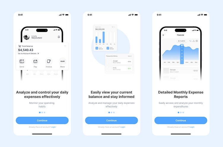
This project involves designing an onboarding (welcome) screen that helps users easily adapt when using the app for the first time. When users enter the app, they will encounter a three-step onboarding process. Each screen is designed to introduce the main features of the app and clearly demonstrate the benefits the app offers to the user.
Screens and Content:
Analyze and control your daily expenses effectively: This screen allows users to analyze and control their daily expenses effectively. It emphasizes this feature of the app to help users manage their expenses better.
Easily view your current balance and stay informed: The second screen provides users with an easy way to view their current balance and stay updated. It encourages users to continuously monitor their financial situation.
Detailed Monthly Expense Reports: The final screen presents detailed monthly expense reports. Users can review past expenses and gain a better understanding of their financial status.
This design focuses on enhancing the user experience and quickly introducing the app's main features. Each screen is designed to be simple and understandable, aiming to inform users and facilitate the use of the app.
