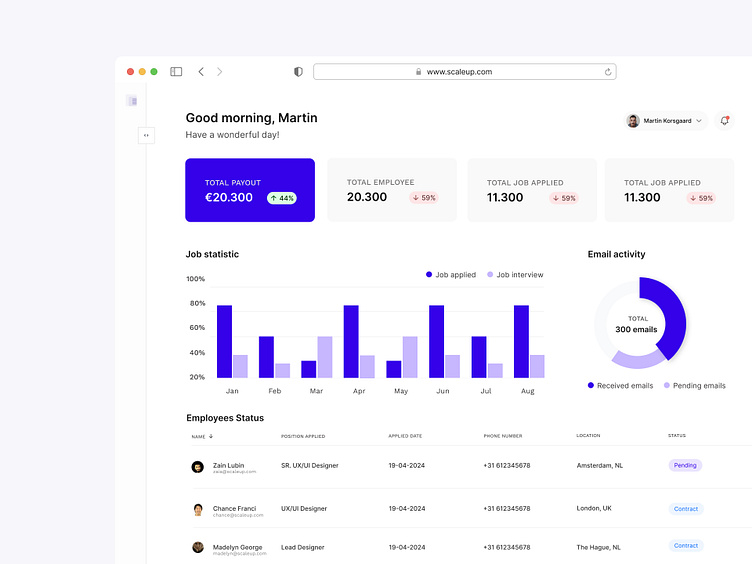
Dashboard for HR Managers
Who is it designed for?
The Job Dashboard is designed for HR managers, recruiters, and hiring specialists working within medium to large organizations. These users are responsible for managing the recruitment process efficiently, posting job vacancies, tracking applications, and selecting the right candidates.
Why did I design this?
The purpose of designing this Job Dashboard is to provide a centralized and user-friendly platform that streamlines the entire recruitment process. It helps users save time, offers clear data analysis, and improves communication and organization around hiring new employees.
Design Choices and Reasons
1. Navigation Bar (Left):
Reason: A clear and consistent navigation bar on the left side makes it easy for users to quickly access different sections of the dashboard without navigating through multiple pages.
Design choice: A vertical navigation bar ensures a sleek and organized look, with key functions such as jobs, applicants, and settings always within reach.
2. Search Bar and Notifications (Header):
Reason: Users need to quickly find specific information and stay updated on important events like new applications or updates.
Design choice: A prominent search bar at the top of the page and a notification icon ensure these features are always visible and easily accessible.
3. Statistics and Overview (Main Content):
Reason: It is crucial for HR managers to quickly understand the current status of their recruitment activities, such as the number of open jobs and new applications.
Design choice: By using clear graphs and statistics in the main content area, users can see key information at a glance without scrolling through long reports.
4. Job Management with Cards and Filters:
Reason: Managing multiple job vacancies can be complex, so it is important to have a clear overview and quickly filter based on relevant criteria.
Design choice: Visually appealing job cards provide a quick view of key details for each job. Filters at the top help users quickly find specific jobs based on their needs.
5. Activity Log and Recommended Candidates (Sidebar):
Reason: HR managers need to stay informed about recent activities and have quick access to potential candidates who fit the job openings well.
Design choice: An activity log in the sidebar keeps users updated on important events, while recommended candidates provide a quick way to discover suitable candidates.
6. Aesthetic and Functional Considerations:
Color Palette: A professional and calm color palette helps create a business-like and trusted environment, which is important for HR professionals handling confidential information daily.
Typography: Clear and readable fonts ensure that information is easy to read and understand.
Iconography: The use of simple and clear icons helps quickly identify different functions and sections without confusion.
Conclusion
This Job Dashboard is designed with the user in mind, emphasizing usability, efficiency, and clarity. By focusing on intuitive navigation, quick access to key information, and a visually appealing interface, this dashboard offers an effective solution for managing the recruitment process within organizations.
