New Personal Project
So yesterday I read a story about a new startup. what was particular about that startup is that it focusing on Tire III and Tire II cities first as their market and then go to Tire I cites. I really loved their market idea mostly because if they where able to crack those Tire III and II market, they are going to a huge success.
But unfortunately their website didn't look any good. I think if you are focusing on a Tire II and II cities, your website should be the best in its class. it should be simple to understand and easy to use. It should me mobile first and things goes on.
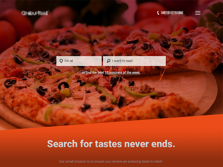
So I decided to re create the entire website design and do it as project. please do share your insight and feedback. As i don't have a pro account, I will share the full size image outside my dribbble.
What you see right is the very rough draft.
