Brand Identity System Applications for Christendom University

Christian education is critical in the global church's responsibility to raise our children up in the fear and admonition of the Lord. That's why the mission of Christendom University was to empower students with skill, knowledge, and faithfulness in all areas of God's creation.

This logo was designed to harken to the classic architecture and historic roots of Christendom University. Let's take a look at the symbolism in this mark!
The holding shape is that of a pew from the university chapel, while the pillar base and interior columns demonstrate strength and stability, much like the pillars of historical buildings around the campus.
The diamond balances the curve of the top, and represents the treasures of wisdom and creativity CHU strives to spark in each student.

Sometimes you need an alternate mark to condense the full name of your organization. This can give your brand an elegant way to scale up or down, depending on the size constraints and the context of your audience in that interaction.
This was a case where we even opted for a three-letter abbreviated logotype, which is easier to say out loud and feels more balanced than simply "CU".

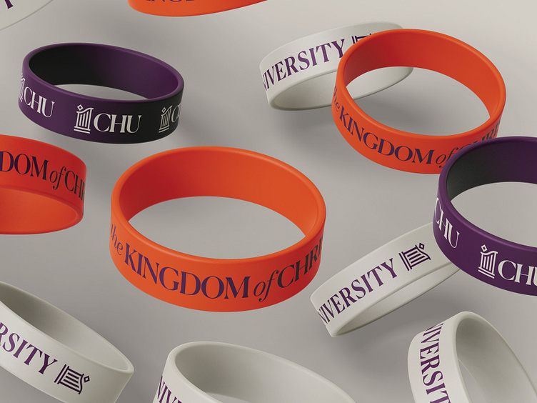
The identity system we designed needed to be bold and flexible across all manner of apparel, exhibitions, and signage. This made the look of the university cohesive anywhere they went, on and off campus.