Car cleaning App Brand design - Wash Me

Wash Me represents a platform that connects vehicle owners to certified washers. The idea was designed for a promoter who wanted to launch the project in the city of Yaoundé.
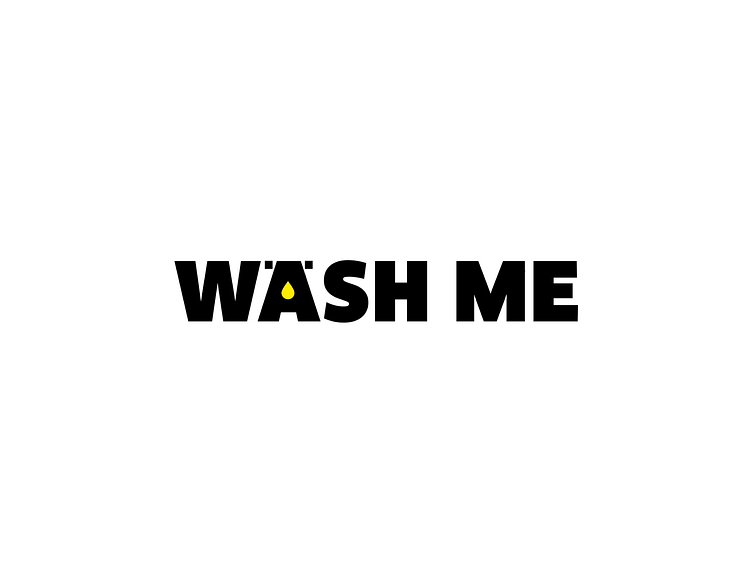
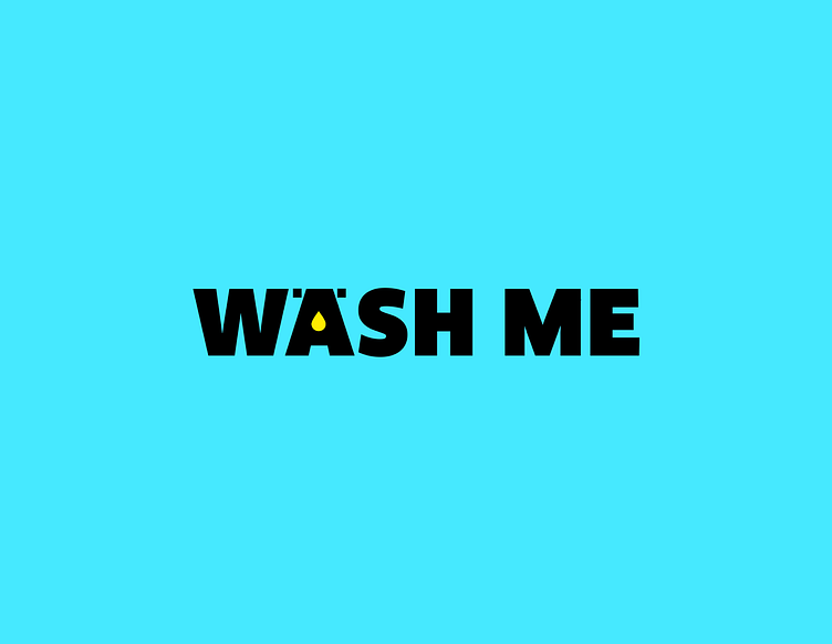
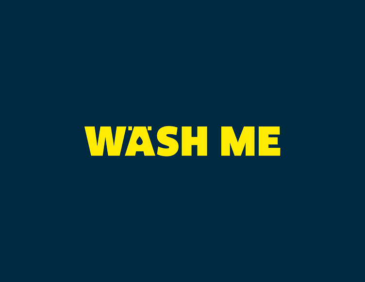
The Wash Me logo is composed of the label "Wash Me" and a drop of water on the letter "A". He is very expressive. Our goal is to represent the strong vision of the promoter and his desire to disrupt the market through a new process.
Design psychology
In Cameroon, as everywhere else in Africa, children have fun writing “Wash me” on vehicles covered in dust. The choice of the label "Wash Me" was made in this sense, making irony of the fact that a dirty vehicle begs its owner to have it washed.
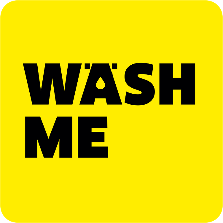
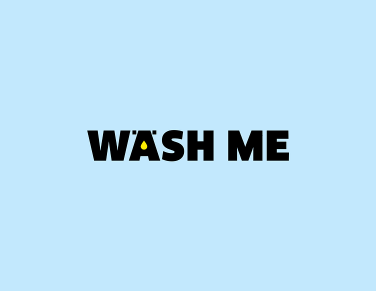
The Wash Me logo is designed to be used primarily with cool colored backgrounds (for example sky blue and all its derivatives). The idea is to communicate the freshness that one feels in a very clean vehicle.
Accessibility
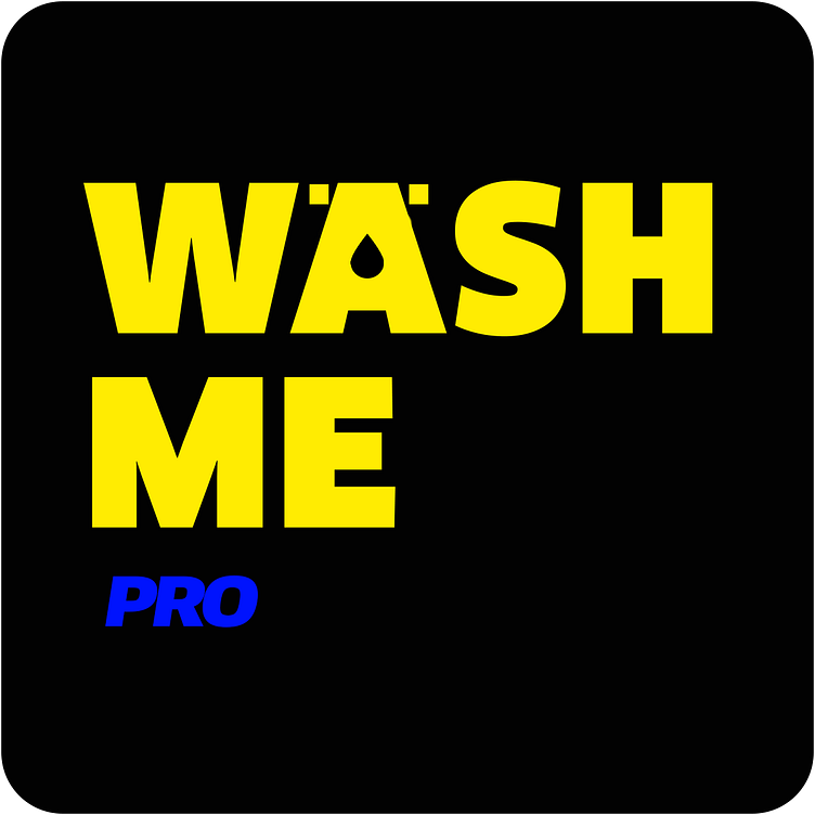
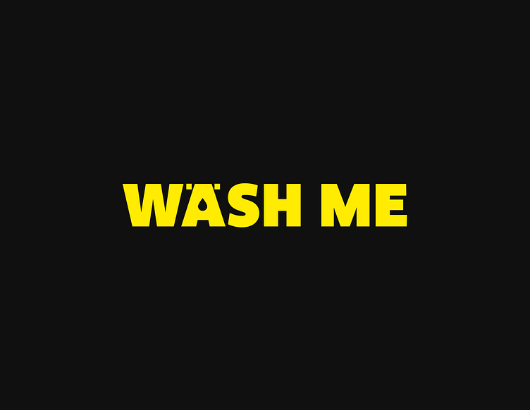
The logo fits perfectly on dark and light backgrounds, a key factor for an application forecasting to include light and dark themes. We defined style for dark colors background
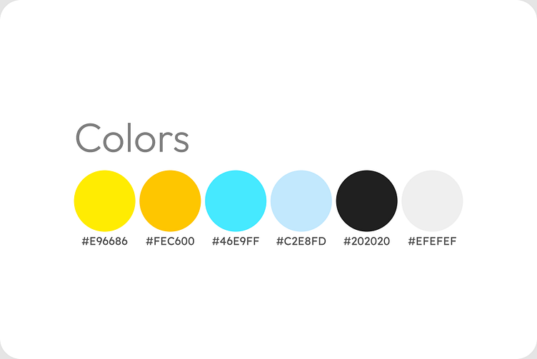
Typography & color
The typography is a sans serif font in a bold style and capital letters.
We chose it because the brand embodies an Alpha type persona, confident and determined
We favored the cobalt yellow color by inverting the blue color generally correlated with cleaning, in order to mark the disruption that the Wash Me application brings to the vehicle cleaning service.
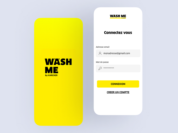
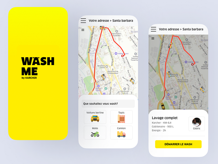
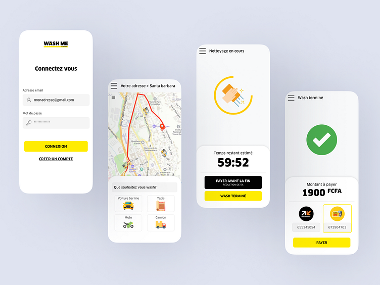
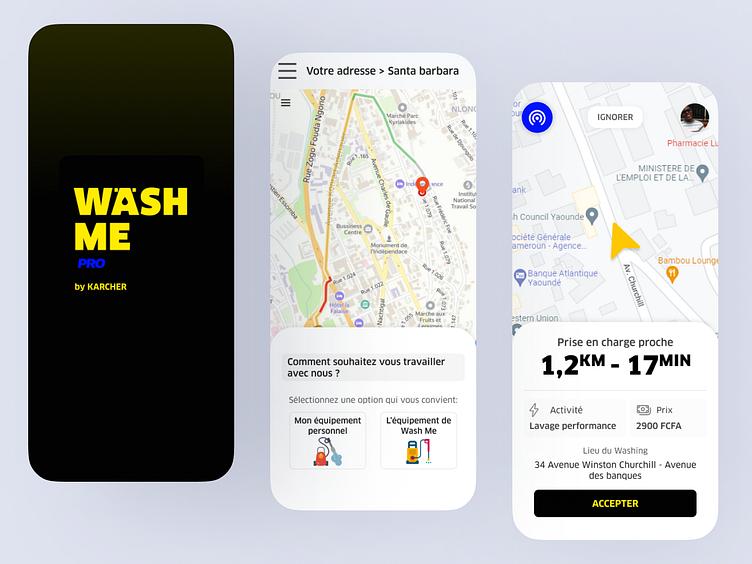
Some interfaces