Hickory Healing House Brand Identity
Brand identity for a couple of dear friends’ new clinic!
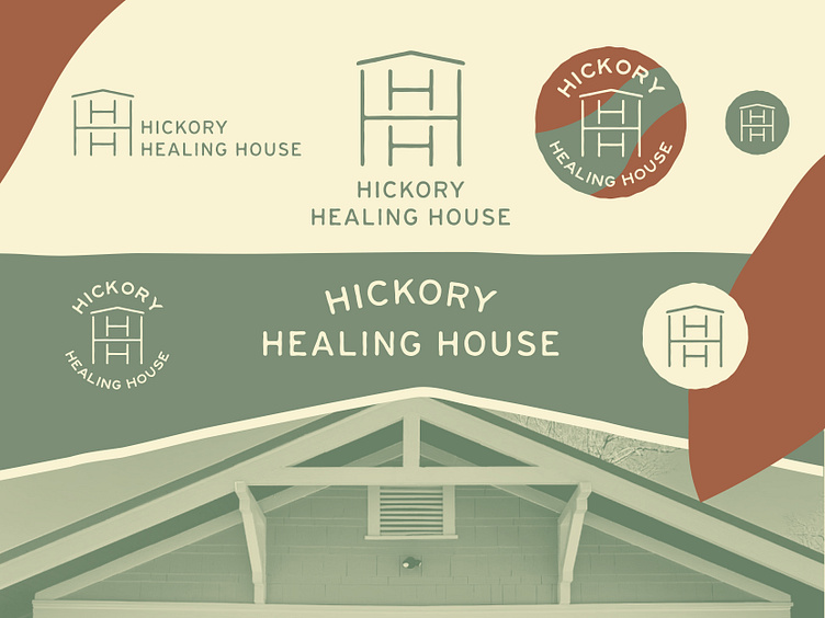
Ryan and Liza relocated from Asheville to Hickory this year and saw a need for additional healing practices in their community. Hickory Healing House offers Chinese Medicine and bodywork, with the intention of bringing on other therapists and modalities in the near future. Congrats on the new business, yall!The mark is made with three H’s to represent the alliterative name. A large H creates a home with two floors, while two smaller H’s represent two body tables for the two owners/workers. The hand drawn typography and styling is soothing, just like their services.
