The 404 error page design concept
The 404 error page design concept:
What was done?
• Research
• UX/UI design
• Illustrations
• Interaction
What tools did I use?
• Figma (text inside an object of a creative form) using tools for working with images/masks/Boolean groups/text/ glass effect, etc.
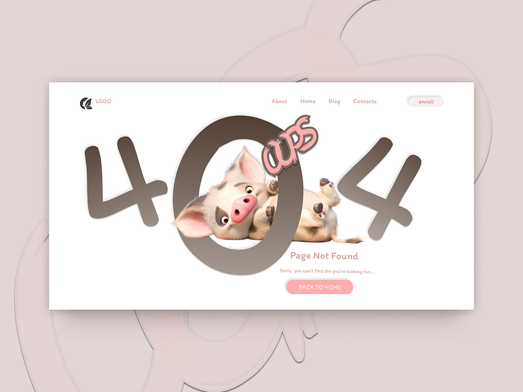
The 404 error page design concept is a combination of humor and a cute image (a pig) to alleviate the frustration of encountering a 404 error. Here's a brief description:
• Color Scheme: Soft pink background with dark pink floral designs.
• Main element: White frame with big bold numbers “404”, where “0” is replaced by a pig’s face.
• Message text: Under the number “404” in smaller font is written “Page not found” and in even smaller font is a call to check the URL for errors and refresh the page.
• Interface buttons: In the upper right corner of the frame there are three round icons, supposedly leading to the main page, for contact by e-mail and to favorites.
This design concept can be effective because it uses elements that evoke positive emotions and provides simple steps to solve the problem.