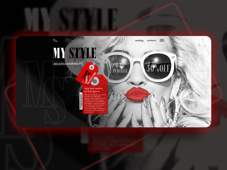
Design concept for the first page of THE OPTICAL STORE WEBSITE
Design concept for the first page of the optical store website:
What was done?
• Research
• UX/UI design
• Illustrations
• Interaction
What tools did we use?
• Figma
(text inside an object of a creative form) using tools for working with images/masks/Boolean groups/text/ glass effect, etc.
The design concept for the optical store “MY STYLE” includes the following elements:
• Branding: A large, bold letter ‘M’ on the left and a partial ‘S’ on the right, both in a dark color palette.
• Promotional Materials: A red tag with text hanging from the top of the ‘M,’ possibly part of branding or promotional material.
• Background: Photo related to eyewear fashion, suggesting a stylish and modern brand identity.
• Slogans: The phrase “style and quality at first glance” emphasizes a focus on style and product quality. These design elements indicate that the store targets modern customers who value style and quality.
