Logo Design for JK Outdoors, an outdoor fishing company

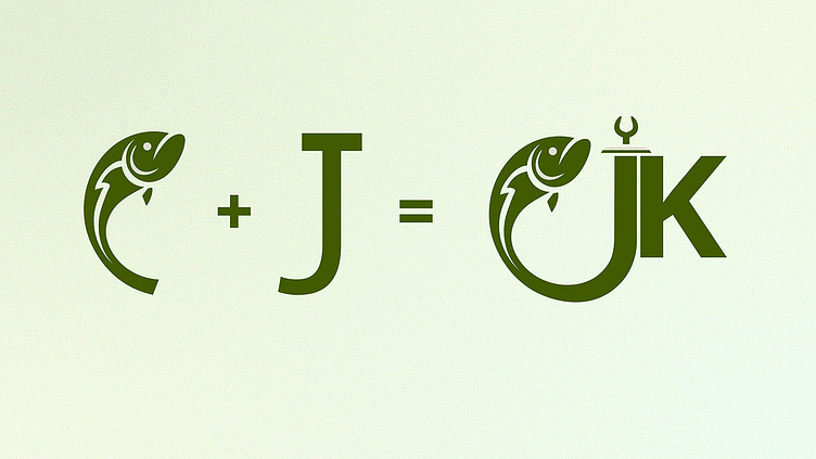

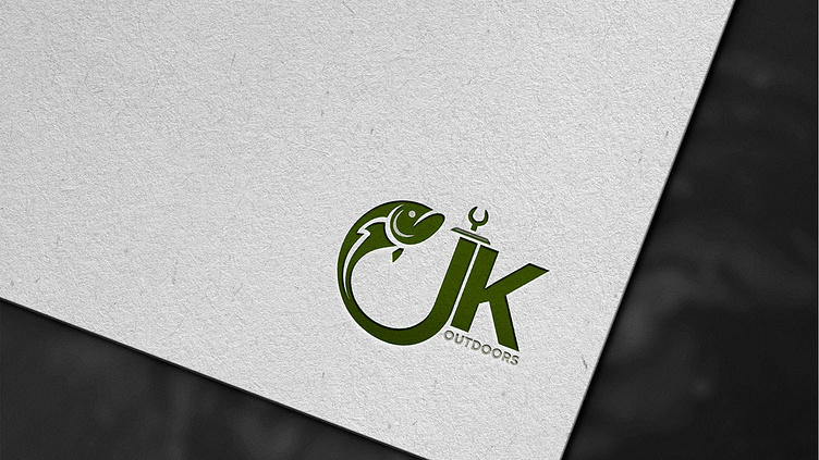

Well, the brief here was to seamlessly integrate the letter J resembling a fish hook, while positioning the fish to the left.
•
But why stop there? I decided to take it up a notch by connecting both the letter J and the fish for a harmonious touch.
•
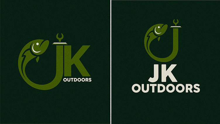
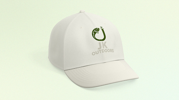
The client also wanted the word 'outdoors' incorporated with the logo, but for me, the logo was doing more than fine. But what to do?! Gotta listen to the client, am I right? Haha! Swipe down to see the alternative variation, catering to the client's preferences.
•
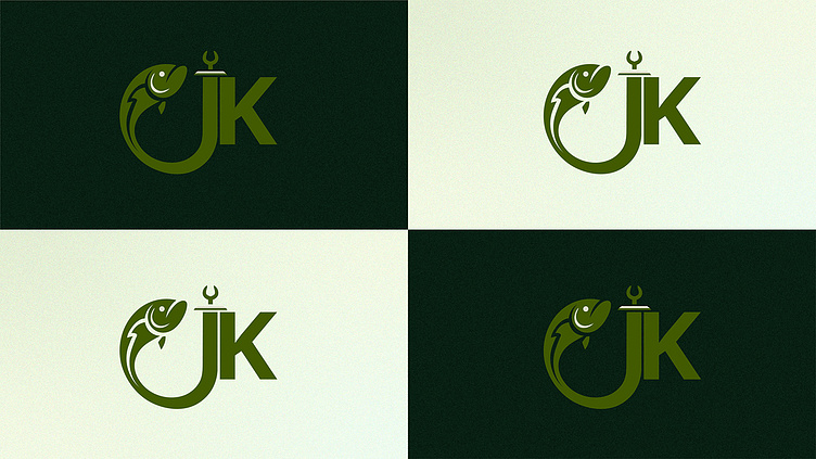
Working on this project was a blast! I love integrating elements and typography to create unique logos.
•
I'm available to both work and freelance, feel free to write me at: li.panidara@gmail.com
