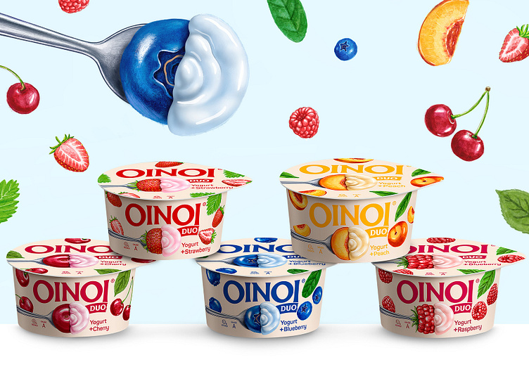
Oinoi Duo Yogurt
The Task
Biolife approached us with a request to create a packaging design for the new Oinoi DUO yogurt brand. The client had a name – Oinoi – which is the name of a beautiful Greek village and an idea – to make the design as clean as possible yet appetizing at the same time. In other words, we were tasked with developing a stylistically modern look that could stand out on a store shelf, while also being simple and pleasing to the eye. Given these parameters, we had a great deal of creative freedom in this project, and we feel that we managed to achieve our goal in this design.
Execution
The Oinoi Duo trademark is written in an easily readable font. Thus, standing on the shelf, it is visible from afar. The Oinoi Duo product represents a 2-in-1 combination - yogurt and fruit jam. A total of 6 flavors. For each individual taste, a specific color and fruit were chosen, however, the main artistic idea remained unchanged. We didn't want to focus only on the particular fruit or the yogurt and its color; instead, we combined them by placing in the center of the packaging an image of only half of the drawn fruit, with the other half being the yogurt. This equal split between fruit and yogurt was placed on a silver spoon, which symbolizes the main action of consuming the product and aims to evoke a feeling of hunger in anyone who takes a glance at the product. The fruits themselves are not only present in the centerpiece of the design but also on both sides of the packaging, being portrayed in an almost falling motion and perfectly complementing both the brand name and the spoon illustrating the consumption of the product.

