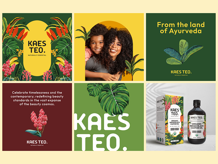
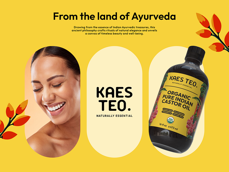
Botanical Harmony: Crafting Kaes Teo’s Ayurvedic Visual Identity
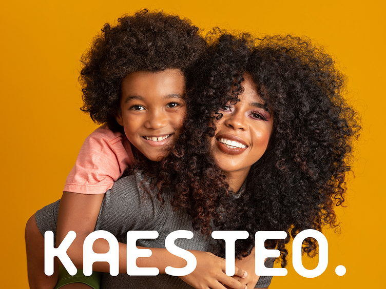
Introducing Kaes Teo, a brand that beautifully merges the legacy of Ayurveda with modern innovation. Inspired by the medicinal properties of Indian flora, we crafted a visual language centered around botanical illustrations. These detailed illustrations serve as the heart of the brand’s identity, symbolizing the purity and potency of their natural ingredients. Complementing these visuals, we incorporated a capsule shape to subtly denote the medicinal essence of Ayurveda. The result is a vibrant blend of natural medicine and beauty care, reflecting Kaes Teo’s mission to harness the power of nature for holistic wellness.