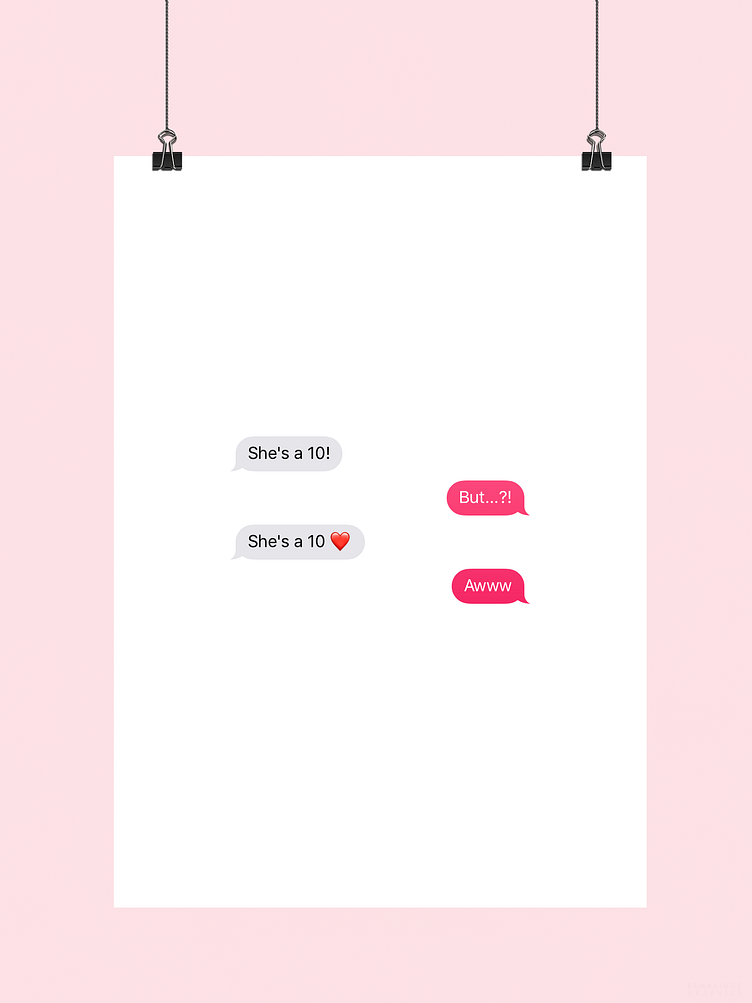
She's a Ten | Typographical Poster
This project that began in early July was based around the idea of designing a typographical poster that would take on a more wholesome approach to the She’s/He’s a 10 meme, by the way of a visual style that combines minimalism and simplicity together.
To see the full project, be sure to head over to my Behance blog :)
More by Karl Bembridge View profile
Like
