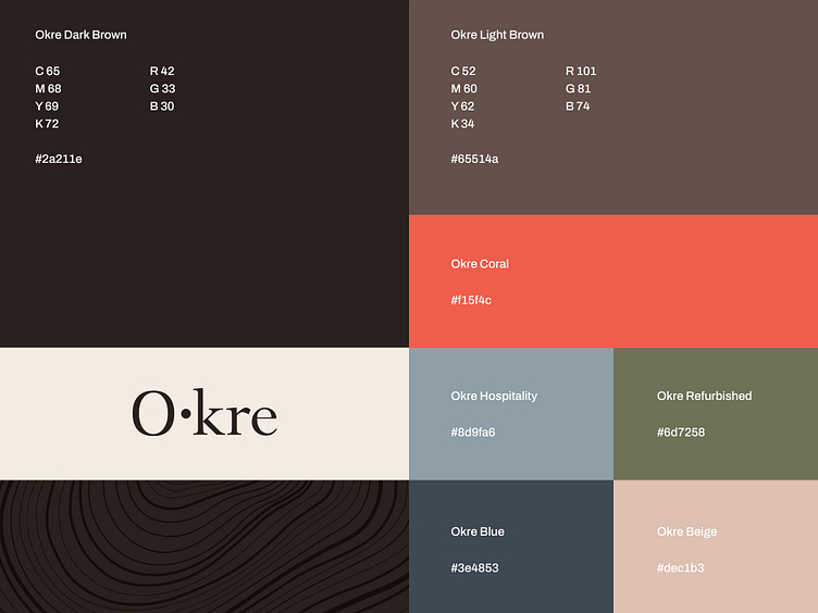
Color Palette Okre
Okre stands as a well-established brand renowned for its premium wood products. We changed some of the elements of their brand identity to make it more up-to-date. The logotype underwent thoughtful modifications, rendering it more symmetrical.
We chose a new color palette to represent the brand and it's divisions. Additionally, we changed their brand typography, completing its brand transformation.
👉 Does your brand identity need a redesign? Contact us!
Ready to Start Your Next Design Project?
More Info: designetiquette.com
Instagram: @designetiquettestudio
Behance: Design Etiquette
Linkedin: Design Etiquette
Get a free project consultation
🤙 Exploratory call : Book a 15 mins call