BRAND PAMPHLET DESIGN
Overall, what this campaign design tries to achieve is to sensitize people to know how landed and housing property is more profitable than any other kind of investment.
Thank you for viewing and reading. Comment your opinion below.
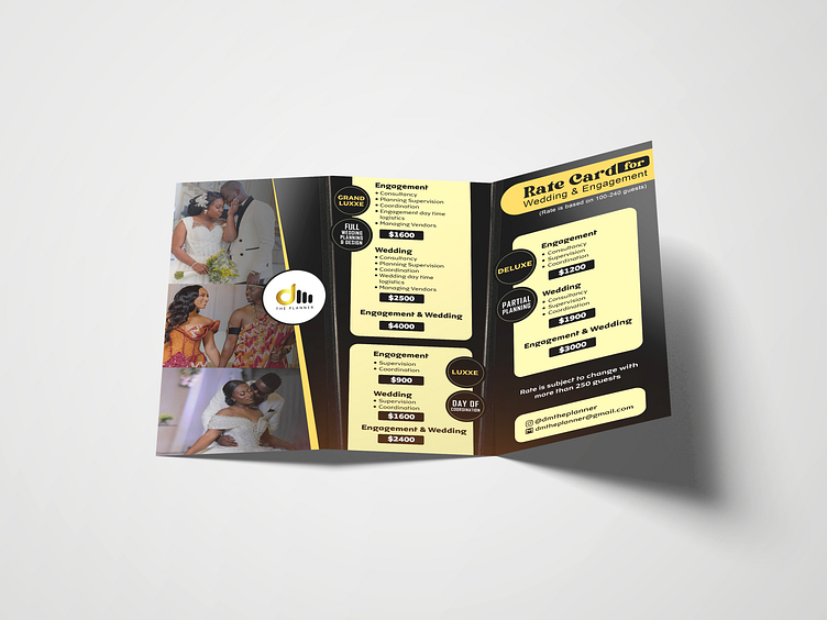
Here's a short analysis of its design and color scheme:
Color Scheme:
Dominant Colors: Black and Gold
Black: Symbolizes elegance, formality, and sophistication. It's used as the primary background color, lending a luxurious and high-end feel to the pamphlet.
Gold: Represents wealth, grandeur, and prosperity. It contrasts beautifully with black, highlighting key elements such as package names, prices, and services offered.
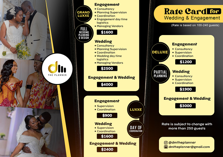
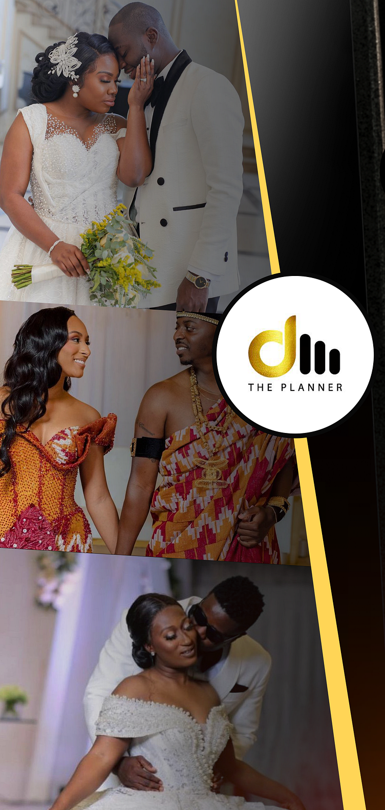
Imagery: The pamphlet features three high-quality images of couples on their special day, capturing moments of joy and intimacy. These images not only enhance the visual appeal but also emotionally engage the viewer by illustrating the end result of the services provided.
The images are placed on the left, leading the viewer's eye from the vibrant moments of celebration to the details of service offerings.
Typography: The text is clear and well-organized, using a combination of modern, sans-serif fonts. This choice ensures readability and complements the contemporary feel of the design.
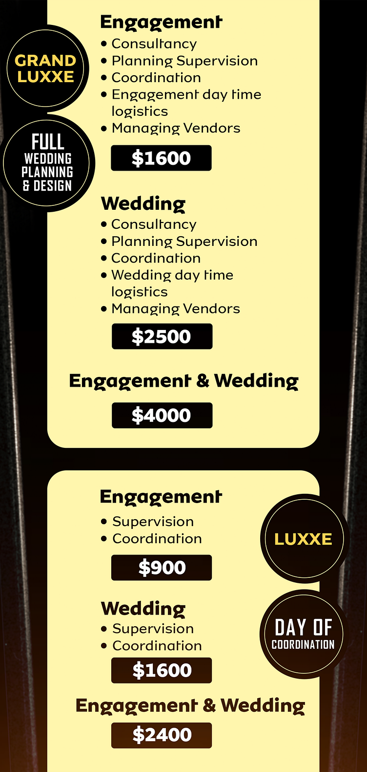
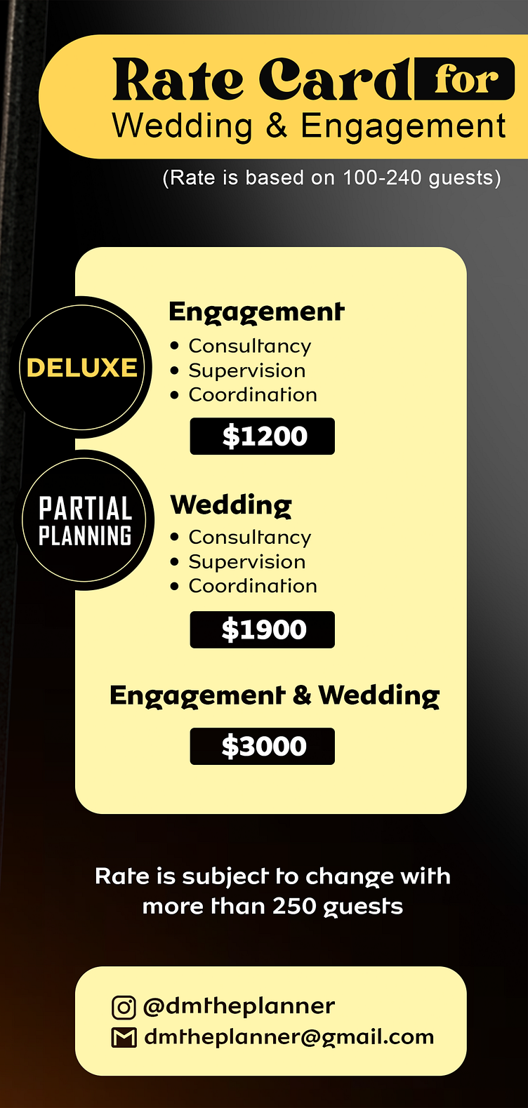
Key information, such as package names ("Grand Luxxe," "Deluxe," and "Luxxe"), and pricing are bolded and prominently displayed, making them easy to find at a glance.
Layout: The layout is divided into three main sections for different service tiers: "Grand Luxxe," "Deluxe," and "Luxxe." This structured approach helps potential clients quickly understand the range of services available and their corresponding costs.
The consistent use of bullet points under each service category efficiently lists the included services, ensuring clarity and ease of understanding.
The right side of the pamphlet is dedicated to detailed pricing information for each package, including engagement-only, wedding-only, and combined engagement and wedding options.
Branding: The company logo, positioned centrally on the left, is prominent and memorable. It reinforces the brand identity and ensures that the viewer associates the luxurious services with "The Planner."
Contact information is strategically placed at the bottom right, encouraging immediate engagement without overwhelming the reader with too much information upfront.
Overall Design: The pamphlet's overall design is cohesive and professional, reflecting the high standards of the services offered by "The Planner."
The use of gold accents against the black background not only draws attention to critical details but also conveys a sense of exclusivity and premium service.
The balance between imagery and text is well-maintained, ensuring that neither element overshadows the other.
Conclusion: This pamphlet for "The Planner" is an excellent example of effective design in the wedding and event planning industry. It uses a sophisticated color scheme, engaging imagery, and clear typography to communicate its services. The layout is organized and user-friendly, making it easy for potential clients to understand the offerings and make informed decisions.
The following are mockups showing how it looks when printed...
Thank you for viewing, your feedback about this project will be highly welcome.
