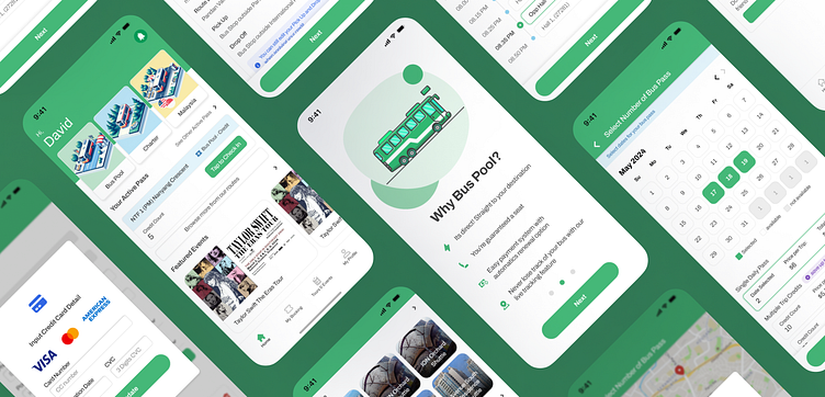
Shuttle Bus Booking App - Redesign
As a freelance project, I recently undertook a comprehensive revamp of a shuttle bus app, transforming its user experience from the ground up. My primary focus was on defining a new, streamlined design system that not only enhances aesthetic appeal but also improves usability and accessibility.
The project involved a full UI redesign to ensure a more intuitive and user-friendly interface. I also crafted UX copy to seamlessly guide users through the app's features. Now, users can easily find and suggest routes, pre-book new routes, and choose convenient pass options. My work focused on highlighting these features and ensuring users are aware of their benefits, ultimately delivering the best possible user experience.
I started by implementing a simple design system to improve the app's overall look and feel.
Next, I focused on refining UI components to improve user interaction.
Here's a sneak peek at the revamped version, complete with a before-and-after comparison to showcase the exciting transformations!
Lastly, upon discovering the company's lack of Figma usage, I recognized the importance of efficient workspace management. I made sure to organized folders and employed standardized component names to ensure seamless navigation. This ensures that even after my freelance period concludes, the workspace remains user-friendly and accessible.
So what do you think about this design?
Tap that 'L' or click love if you like this post, and drop your thoughts in the comments below. Your feedback is golden. Appreciate it! Have a nice day! ✨🚀
If you have any questions, ideas, or simply want to connect, please don't hesitate to reach out to my email fathom.alim.h@gmail.com or my Upwork. I'm always eager to collaborate and explore new opportunities!


