Arista Therapy
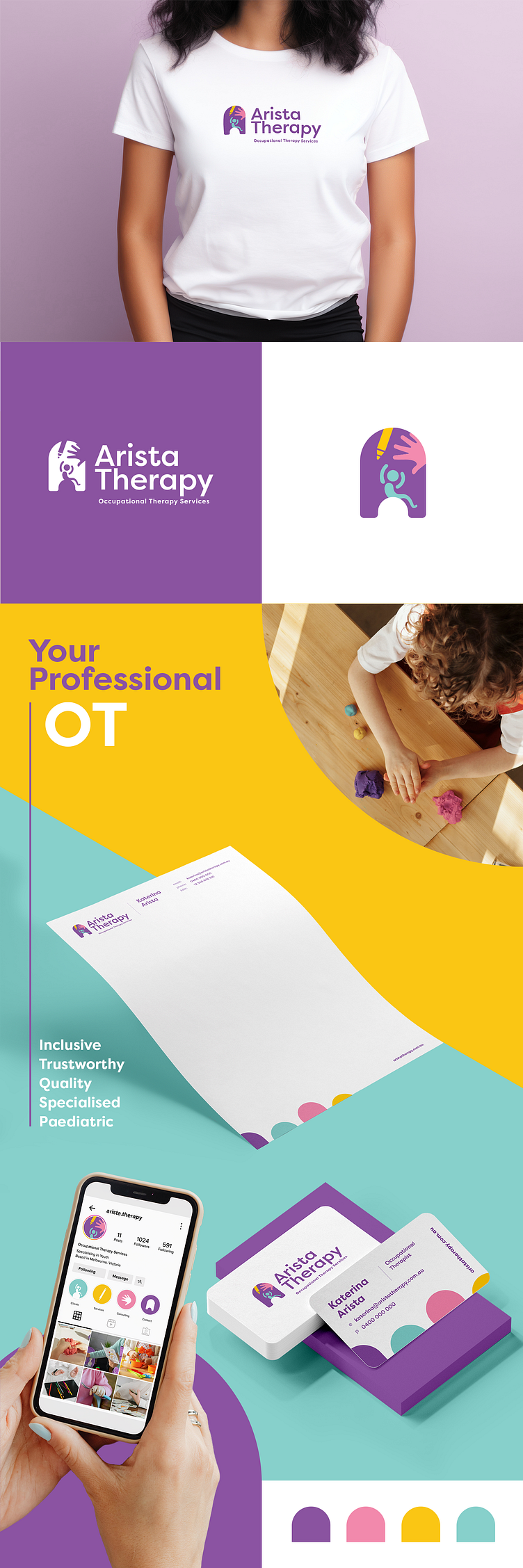
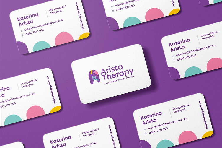
Arista Therapy is a newly established, Melbourne Occupational Therapy business targeted at paediatric clients including those with NDIS support. The founder, Katerina, wishes to help children and their families reach their full potential. She envisioned a brand that was professional, friendly and a clear representation of the business values and targeted services. The core symbol for Arista Therapy is our welcoming, balanced and inviting arch of opportunity. Our secondary foundation element is the 'A' which symbolises strength, high quality and success. Merging these two elements resulted in a friendly shape that cohesively holds all the unique brand icons together in completeness.
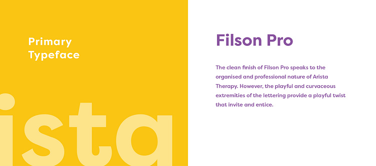
The notion of full potential comes from the company name itself ('Arista' meaning 'excellence' in Greek). Drawing from this inspiration I developed unique and recognisable visual elements that directly represented Arista Therapy’s services and clients. We aimed to communicate a multitude about the business from a first impression. It was no question that the brand was destined for a youthful essence and therefore required a vibrant, inclusive and diverse colour palette. The playful curves in the primary typeface complete the logo with a professional yet energetic final touch.
