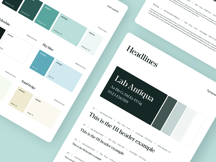
Styleguide and website for the funeral brand
Can a funeral brand bring calm and trustworthy associations rather than sadness?
The answer of our client was yes, so we created a brand concept that reflects professional but caring approach. We used brighter color palette and reject greys and black towards some lighter colors refers to natural landscape environments and chose professional but nontrivial font.
The first version of the website was created on the base of the Webflow template, that was customised to the brand guidelines, with adjustments of the layout as well.
More by Software Mansion View profile
Like


