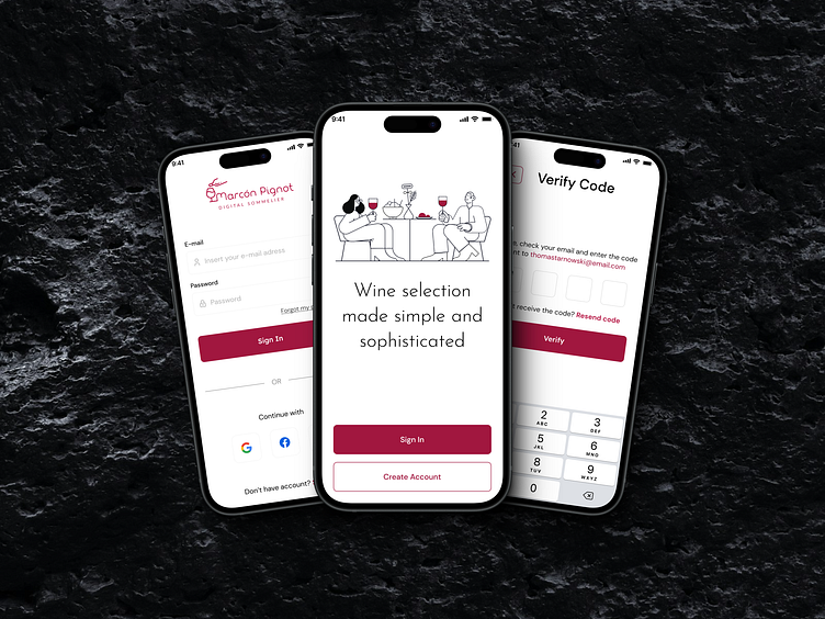
Marcón Pignot - Digital Sommerlier - Login & Verification Screen
As the designer behind the "Marcón Pignot" Digital Sommelier app, I set out to create an experience that encapsulates the elegance and sophistication of wine selection. This journey began with crafting a cohesive design narrative, starting from the moment users open the app.
Splash Screen
The splash screen sets a striking yet welcoming first impression with an illustration of a convivial scene – wine glasses clinking and friends enjoying a bottle. It invites users to a refined experience, reinforced by the tagline, "Wine selection made simple and sophisticated," which succinctly communicates the app's mission.
Login
Simplicity and accessibility guided the design of the login screen. Users can log in with their email and password or via Google or Facebook. The clean, minimalistic design and subtle color palette ensure readability and usability, with prominent “Sign In” and “Create Account” buttons to reduce user friction.
E-mail Verification
Security and ease of use were key in designing the verification screen. Users are prompted to verify their identity by entering a code sent to their email. The process is straightforward, with reminders to check email and options to resend the code if needed, ensuring an intuitive and effortless user experience.
Feel free to reach out to me for freelance projects.


