Doodlybank SaaS WebApp Dashboard Design
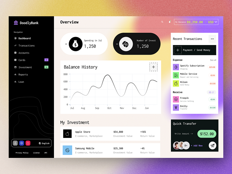
I'm excited to share a sneak peek of my latest project - a comprehensive banking app designed for desktop SaaS WebApp! This user-friendly interface is crafted for bank users and account owners, focusing on intuitive navigation and essential financial insights. Here's a breakdown of the features:
Navigation Bar: Located on the left side, it includes sections for Dashboard, Transactions, Accounts, Cards, Reports, and Loans. The bottom section features User Profile, Settings, Logout, Language options, and a Footer.
Top Right Corner: Provides a balance check, multi-currency view, notifications for updates, and quick access to reports and transactions.
Main Dashboard:
Spending Overview: Track monthly expenses.
Investment Summary: Overview of investments, including company names, types, amounts, and profit/loss.
Balance History: View balance trends over the past six months and request an updated balance with a "+" icon.
Right Section:
Recent Transactions: History of expenses and receipts.
Quick Transfer: Easily select an account or user, enter the amount, and send money. Add new accounts directly from this card.
Stay tuned for more updates! Your feedback is highly appreciated. 🙌


