19/32 – Milwaukee Stags
Deer Crossing
The Milwaukee Stags are team number 19 for #theUFLProject, and the third team of the Great Lakes Division.
Winners of the first-ever Ultimate Championship Game in history, the Stags were the epitome of an underdog success story in the early seasons but in modern day they have been all bark and no bite. The Stags have managed to capture one division win in the past 5 seasons, tightly packed within a bundle of sub 6-win records. The silver lining of it all is the near 500-yard performance orchestrated by their young quarterback in a Season 26 playoff game that their lone division title earned them a ticket to.


Visual Direction
The Stags are named after the large native white-tailed deer population (also the official wildlife animal of Wisconsin) and the surrounding culture of trophy-class deer hunting. The most distinguishable characteristic of the stag is the antlers – the larger the antler rack, the higher the score.
Milwaukee sports a brick red and bone gold color scheme – encapsulating an aesthetic that includes the choice of material used in a handful of the city's iconic buildings and golden tone picked from the antlers of a stag. A note – the latter color is actually a couple shades away from another suitable color for the Cream City.
Execution
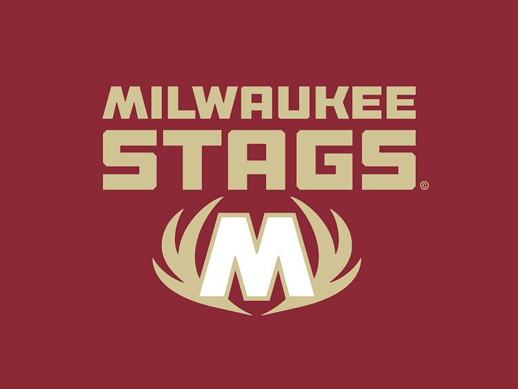
In an effort to differentiate from the Stags' theoretical sibling franchise, the NBA's Milwaukee Bucks, this team leans in to the visual of an impressive antler rack and away from the actual animal. The primary logo is a burly "M" for Milwaukee mounted upon an antler rack.
The secondary mark is a profile-view of the antler that is most notably featured on the team's iconic helmets. This mark can be extracted and used as a shorthand identifier as it piggybacks off of the recognizability of the team's lid.
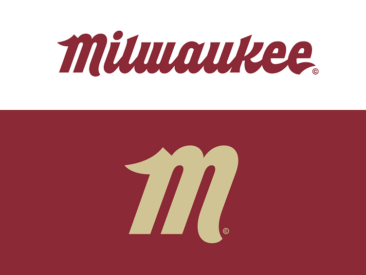
The tertiary mark is a stylized "M" with antler-like serifs that is most often used as a mark for merchandise. It comes from the full "Milwaukee" script of the same style, which is a resurrection of an unused wordmark concept from 2015. The script is a nod to the many breweries and taverns that are abundant in the city.
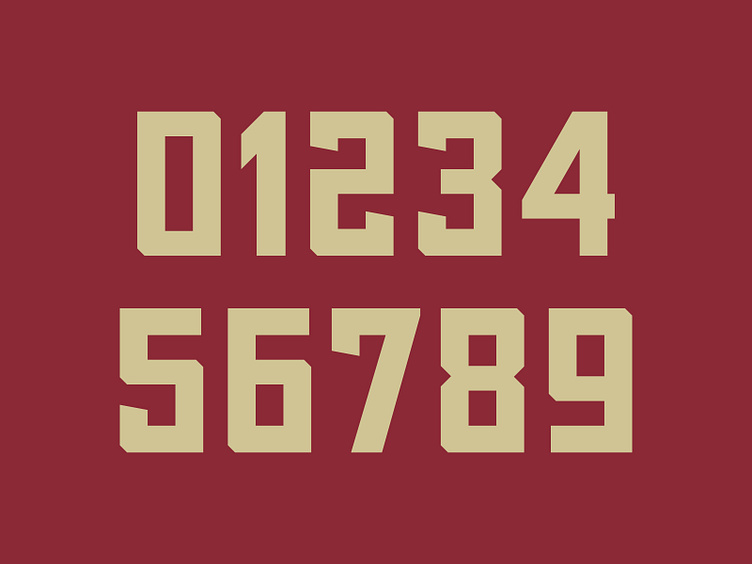
Each letterform for the Stags' main team name and location name wordmarks is thick, sturdy, industrial, alludes to Midwestern grit. This same style is applied to the jersey number set with modest 45 degree chiseled corners and a rather rectangular footprint.
Miltown Melee
The Milwaukee Stags are now armed with a proud new graphic suite and a refreshed identity that embraces the city in which it calls home.
Football Helmet Mockup by SportsTemplates
____________________