Campus Events Webpage
As part of my database systems course in college, my friends and I had to take up a problem statement relevant to our institute and turn it into a real-time webpage.
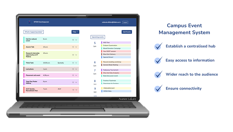
My group decided to make a centralised webpage incorporated in our institute portal to showcase all events taking place in our college daily. This will allow the students as well as the staff to access information about the events taking place on campus on a single platform.
Our aim was to have a user friendly and simple interface which allows the viewer to understand and differentiate between the events easily. Instead of overloading each student with millions of emails everyday, having a page where you can just click in and check whats happening would be a much easier. This would be much fruitful as students will be informed about the upcoming events and thereby increase participation.
I designed the UI for this webpage considering all the aspects we wanted to be delivered to the users. I made use of Figma for building the prototype for the same.
The home page consists of that particular day's (present day's) events on the left hand side and upcoming week's events on the right hand side. This allows the user to view today's events with full details but just a preview of the upcoming events.
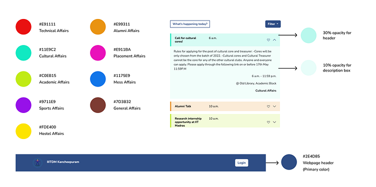
I made use of the 'Nunito' font as it was a simple yet very bold and capturing font. I wanted a formal font which also gives a dash of fun to make it appealing to the students especially to want to read about the events.
I gave unique colors to the 9 different departments of our college through which events are conducted. This allows the viewer to have a visual segregation of events and can potentially remember the color of a department of their choice and focus on the same. The variety of colors also makes it more appealing and attracts attention.
We have further implemented all the functionalities from the students' point of view while viewing the page as part of the user experience.
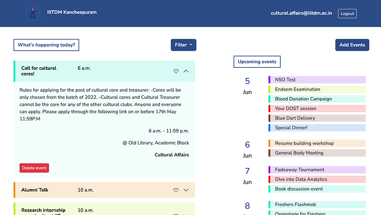
An arrow was shown on each event box which when clicked shows the complete description of a particular event.
A heart icon to favourite events is also provided which allows the users to favourite events they give importance to or want to have a separate recognition for.
A filter option for the users to view only the events of a particular department.
Allowing users to hover over and view upcoming events and then coming back to the present days events.
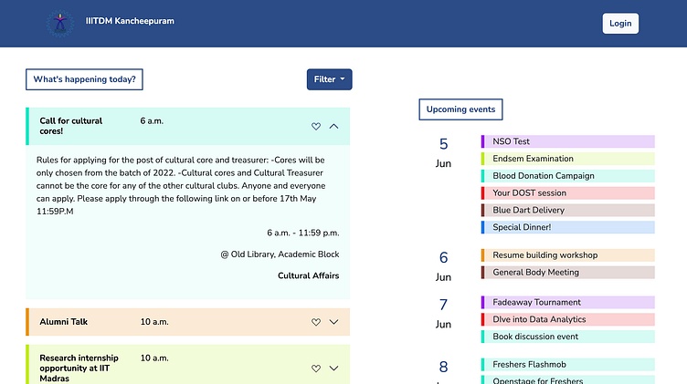
Clicking on the arrow gives you description and more information about the time and venue of the event.
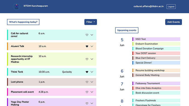
Clicking on the heart icon allows the logged in user to have a category of favourited events.
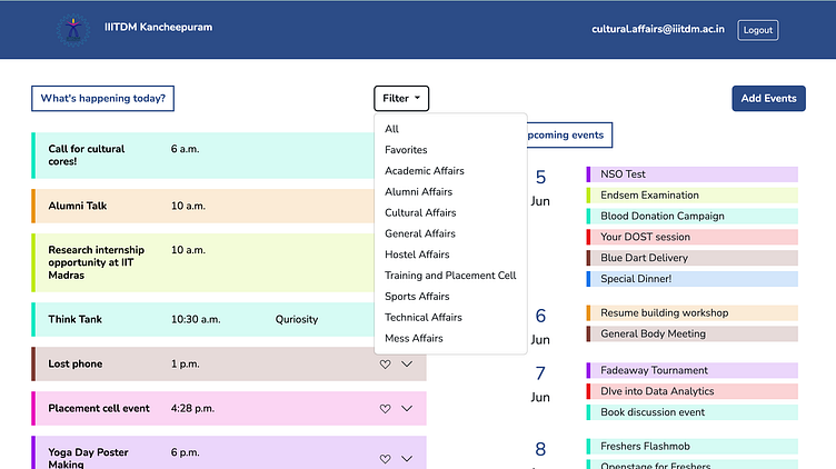
Clicking on the filter button, a dropdown of all the options of the different departments along with favourited events and all events are given. Viewers can select one and only those events will be hence shown.
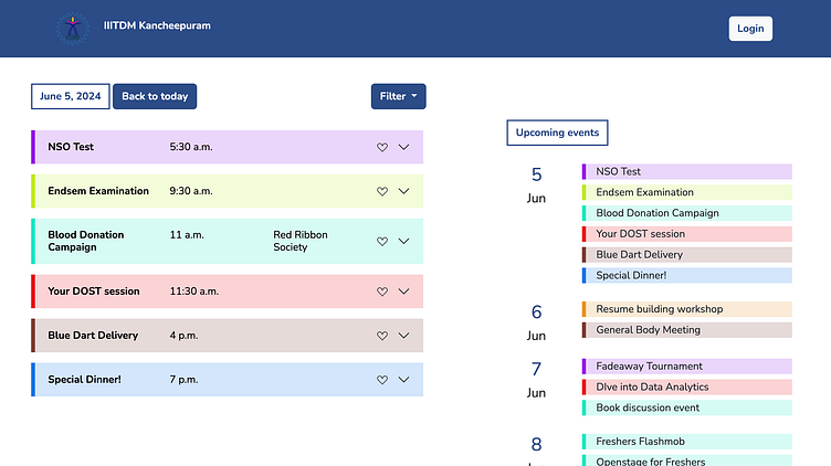
Clicking on an upcoming date shows the user that particular dates events with more details. The 'back to today' button allows the user to go back to the home page where the present days event's are shown.
Our responsibilities in this project included the authentication of users along with identity access management according to the user type. Hence, I designed a login page to facilitate the above.
Integrating a photo of the college entrance with a blur overlay as a backdrop to the login modal gives a more professional and polished look to the webpage drawing attention to the form.
I continued with the primary header color for the text of the form and the login button to show uniformity. The image as the background already had a lot of colors so adding more colors would've been a wrong move.

We have also given authenticated users the permission to add and delete events. If the logged in user has a department email, it is allowed to add/delete events of its own department only.
Hence, I added an add events button on the top right corner maintaining consistency of the buttons UI throughout the webpages. For the delete button, I used a bright red to make it instantly visible to the user in the description box. I didn't want to show it on the main events box as it would be disturbing to have so many options in front. Also, having the delete button in the description box allows the user to read the details once and confirm if they really want to delete it or not and whether it is really the correct event they want to delete.
This website has been developed by my friend and I as part of our course project and we're ecstatic about how it has turned out. Using the software Django for the backend, MySQL for the database server , and HTML, CSS and Bootstrap for the frontend has given us an in and out understanding about each of these tools in the industry.
This project taught me a lot and got my first design into reality - an actual website!
