NutriPlanner app 🥦
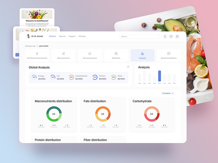
In the design of the NutriPlanner app, I embarked on a meticulous journey to create a digital interface that seamlessly blends functionality with aesthetic elegance. The primary challenge was to design a user interface that not only appeals visually but also enhances the ease of navigating complex nutritional information. By incorporating a clean, modern layout with soothing color palettes and intuitive design elements, we crafted an environment that invites users to engage deeply with their nutritional planning😊.
Attention to detail was paramount in this project. We chose a soft, neutral color scheme that reflects calmness and wellbeing, resonating with the health-focused nature of the app. These choices not only make the app pleasing to the eye but also facilitate a relaxing user experience. The typography and iconography were carefully selected to complement the overall design, ensuring that each screen is not only functional but also harmonious and accessible🌱.
Interactive elements such as dynamic charts and customizable meal plans are highlights of NutriPlanner, designed to offer users a personalized experience. The use of subtle animations and responsive touch controls enhances usability, making complex tasks like tracking macronutrient intake and analyzing dietary trends both straightforward and enjoyable📊✨.
The culmination of this project is a visually striking and highly functional app that stands as a testament to the power of thoughtful design in the digital health sphere. NutriPlanner is not just a tool; it's a daily companion that supports users in their journey towards better health and nutrition, demonstrating the profound impact of combining aesthetic design with practical functionality in creating effective digital solutions💪💚.
Elevate your brand with design that speaks volumes. Let's craft your digital success story together: 📫klimevtushenko@gmail.com


