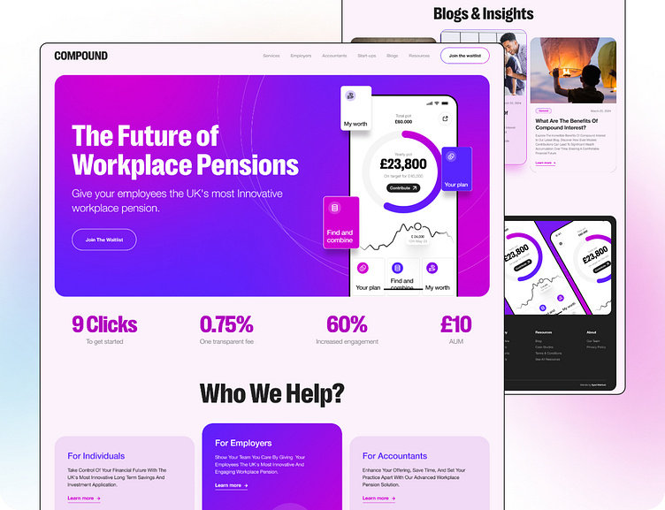
Compound Digital Website Redesign
Hey Everyone 👋🏻
We are thrilled to share the exciting news about the successful launch of Compound Digital's new website. The Devflow agency enthusiastically collaborated in devising a fresh visual approach and constructing a Webflow-based site for our Compound Digital initiative.
Overview
Despite having a robust service offering, their website was outdated, lacked user-friendly navigation, and did not effectively communicate the value proposition that differentiate Compound Digital from competitors. This led to high bounce rates, low user engagement, and suboptimal conversion rates.
The Project
Our core objective was to redesign the Compound Digital website to improve user experience and better communicate the brand’s value propositions. The existing website, while functional, was outdated in terms of design and lacked several key features that modern users expect. Additionally, the website needed to address the growing need for mobile compatibility and improved accessibility.
Key Issues with the Existing Website
Outdated Design: The existing website had an outdated design that did not convey the cutting-edge technology and security of Compound Digital.
Complex Navigation: Navigation was complicated, making it difficult for users to find information quickly.
Low Conversion Rates: The website was not effectively converting visitors into leads or customers.
High Bounce Rates: The layout was not user-friendly, leading to high bounce rates.
Unclear CTAs and Content: There was a lack of clear calls-to-action (CTAs) and engaging content.
The Solutions
Modern TEC: Developed a clean, modern design that reflects the advanced technology focus of Compound Digital.
Intuitive Navigation: Simplified navigation with a clear, intuitive menu structure.
Informative User Guidance: Created engaging, informative content to guide users throughout the site.
Strategic CTA Integration: Introduced prominent and strategically placed CTAs to encourage user engagement and lead generation.
Unclear CTAs: There was a lack of clear calls-to-action (CTAs) and engaging content.
The Results
Bounce Rate Decreased: The bounce rate decreased by 35%, indicating that users were finding the content more relevant and engaging.
Enhanced User Engagement: Time spent on the site increased by 40%, showing improved user interest and interaction.
Lead Generation Increased: Lead generation increased by 50%, attributed to the new CTAs and optimized landing pages.
Higher Conversion: Conversion rates for specific actions improved by 45%.
Unclear CTAs: User feedback indicated a higher confidence level in the security measures of Compound Digital.
Now it's time to see the full preview...
Conclusion
The website redesign for Compound Digital successfully addressed the initial problems, resulting in a more user-friendly, engaging, and secure online presence. The project not only enhanced the company's brand image but also contributed to significant improvements in user engagement and conversion rates. Compound Digital is now better positioned to attract and retain customers, solidifying its reputation as the world’s most secure pension solution.
Check the design live here: https://www.pure-growth.com/
--------------------------------------------------------------------------------
Devflow Agency
We are a comprehensive design agency that specializes in designing websites and user interfaces. We also have expertise in turning your beautiful static designs into live in webflow. So devflow is a digital agency where you get everything between design and development under one roof.
Devflow comprises a team of both designers and developers, working collaboratively to create innovative solutions. Our team is eager to transform your ideas into seamless UI and impactful UX. We also provide SEO services.
We are available to work on your awesome projects,
drop your business inquiry to :
✉️ E-mail : syedmahbub.mu@hotmail.com
💬 Skype : s.tanbir


