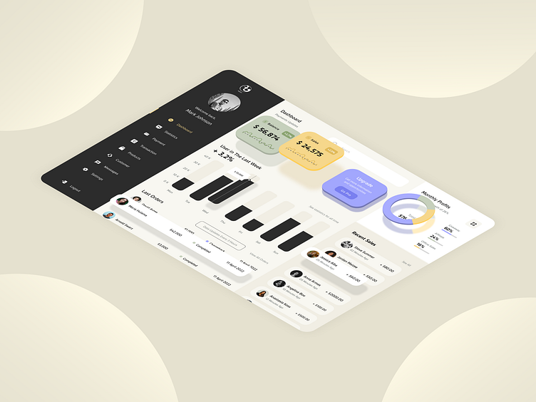
Revamping Taka Invest: Dynamic Dashboard Redesign 🚀💼
Aesthetic Appeal and Visual Design 🎨
My redesign of the Taka Invest dashboard incorporates sleek aesthetics with filled icons and smooth corners, creating a visually stunning user interface. Experience the original website here.
Seamless Integration and Elegant Structure ✨
Every element in the redesign seamlessly integrates into a well-structured layout with precise alignment. This enhances usability and ensures a cohesive user experience throughout the platform.
Detailed High-Fidelity Wireframe 🖼️
I meticulously crafted a high-fidelity wireframe that serves as the blueprint for the redesign. This detailed plan outlines each component and interaction, ensuring thorough design implementation.
From Blueprint to Reality: Wireframe vs Actual Design 📊
I conducted a meticulous comparison between the high-fidelity wireframe and the finalized design. This step ensures consistency and accuracy, translating the conceptual vision into a polished user interface.
Bringing Design to Life: iPad Mockup 📱
To provide a realistic preview, I created an iPad mockup showcasing the redesigned dashboard. This visual representation illustrates how the design functions on a device, enhancing its usability and aesthetic appeal.
Harmonious Palette and Modern Typography 🎨
The design features a harmonious palette of Spring Wood, Heavy Metal, and Soft Peach, complemented by the modern 'Gesta' font. These choices enhance readability and aesthetics, creating a contemporary and engaging user experience.


