OneDigitalOffice – Logo for an Insurance Portal
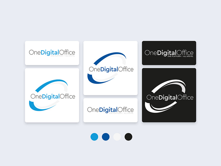
For the OneDigitalOffice Insurance Portal, I designed a versatile logo that comes in three color variations: two featuring brand-compliant shades of blue and one white, intended for use on dark or colored backgrounds.
The extended version of the logo incorporates arcs that symbolize a circle and consistency, reflecting the platform’s comprehensive and reliable nature. These arcs also join the letters “O” together, resembling the orbit of satellites, which signifies the interconnected and all-encompassing nature of the platform.
Additionally, there is a simpler font-only version that plays on the contrast of light and bold font weights, ensuring flexibility and adaptability across various applications while maintaining a strong brand identity
