VINNY'S MONTESSORI CENTER | LOGO DESIGN & BRAND IDENTITY
Vinny's Montessori Center's mission is to create a holistic learning and development environment where children are ignited with a passion for learning and exploring the world around them through the Montessori method – a world-renowned method of promoting children's independence and confidence. Each child at Vinny's Montessori Center will learn how to self-manage, solve problems on their own, and develop their creative thinking abilities.
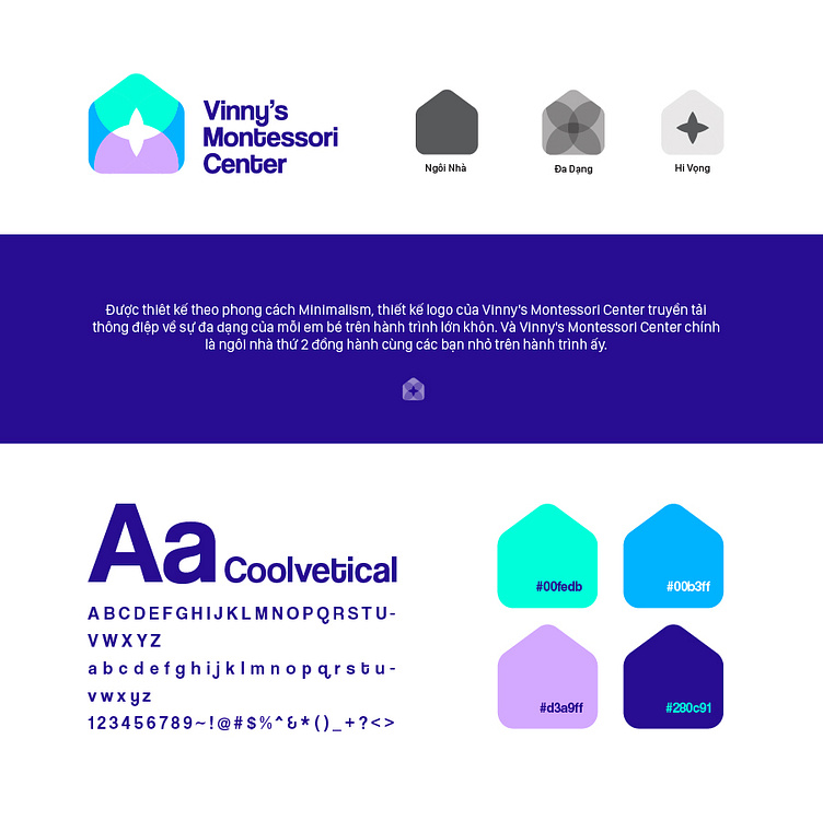
Vinny's Montessori Center's brand identity is built with cool tones, creating harmony and aesthetics while conveying the center's message and values. These tones help convey Vinny's Montessori Center's core values: freshness, creativity, safety, trust, hope, and discovery. Each color contributes to the creation of an ideal learning environment where children can develop comprehensively both physically and mentally. The brand identity with cold tones is not only beautiful but also easy to identify, making Vinny's Montessori Center stand out and different from other preschool centers.
Designed in the style of Minimalism using simple, easily recognizable shapes, Vinny's Montessori Center's logo design conveys the message of the diversity of each baby on the journey of growing up. And Vinny's Montessori Center is the second home to accompany children on that meaningful journey.
Designed by Bee Art
-
Client Vinny's Montessori Center
Logo and Branding Project. Logo is designed for a coffee brand in Vietnam.
Copyright © Bee Art. All Right Reserved
Contact us:
• Hotline/ Zalo: (+84) 77 34567 18
• Email: info@beeart.vn
• Website: www.beeart.vn
• Facebook: https://www.facebook.com/BeeArt.vn