ĂN ĐI | LOGO & BRAND
ĂN ĐI [Logo and Branding Project]
🟢 Logo | Branding | Brand Identity
🟢 Field: Restaurant
🎨 An Di wishes to design a logo: Traditional style
🎨 An Di is a brand that provides food and beverage services at a remote location or locations such as hotels, hospitals, airplanes, etc. Therefore, An Di's logo needs to represent the element traditions as well as the services that the brand provides.
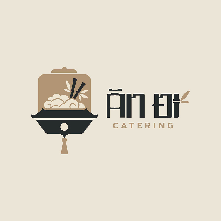
Kaiza came up with the idea of designing a logo with a rice bowl symbol stylized to resemble clouds, showing that An Di will provide delicious food quickly and anywhere according to customers' needs. . The image of bamboo chopsticks familiar to every meal of Vietnamese people has made the logo more rustic and traditional.
As a food brand with the characteristic of traveling long distances, the hygiene factor will be given top priority, so Kaiza designed a food lid that resembles a lantern and represents the element. Hygienic, clean but still rustic and traditional.
Kaiza's square font resembles a seal, showing a soft but no less delicate beauty while still expressing the traditional elements in the logo, creating an overall professional, unique logo that attracts customers right from the start. the first look.
Designed by Kaiza
Copyright © Kaiza. All Right Reserved
Contact us:
KAIZA CO.,LTD
• P: 0889 996 399
• E: info@kaiza.vn
• W: www.kaiza.vn
Connect me @ Behance - Instagram - Pinterest


