Case Study: Dyson App User Experience
I got my first Dyson 2 weeks ago
And everyone told me it was going to be impossible to use another brand after that, I think it is a bit too early to say it, but I have no problems with the product ever since, so I think I am going in this direction of being a really satisfied consumer.
On the other hand
I was surprised when I found no instructions in the box, instead, all the print information indicate that I should download the app. I thought: "WOW, my "simple" cordless vacuum cleaner will be somehow connected with the app, that is cool!
Well, that was not the case. For me the app is a kind of online manual that could have been a webpage, I don't see any reason to have the app after you learn how to use and maintain your vacuum. I see that other products have better integration with the app, like the robot vacuum. But I also believe that are many other customers that just as me, don't buy the smart products, so how to increase the value of the app?
Adding more feature would be essential
But I also believe Dyson could improve a lot by doing simple and cheap changes that would improve a lot the user experience. I made some notes and created some mockups with the improvements I see, and I add all of them in the images below.
You will note that gray background indicates how the app is now (there is also a 'current' and 'new' over the mockups) and green background are my changes 😊. I added also some comments here and there with some design concepts and side ideas.
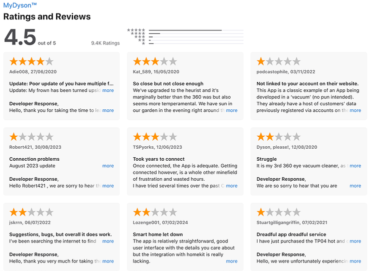
Lets start by real data from users
In the app store the app is not terrible, 4.5 stars is actually pretty good. But when we notice that there are some 2020 evaluation with comments, we can see that at least part of this rating is not about the current version of the software. So this rating doesn't speak much about specifically the version I critique here 🤷♀️. But I have to say that at least personally I found no bugs or technical problems in the app. It runs smoothly, so maybe part of this 4.5 is due to that.
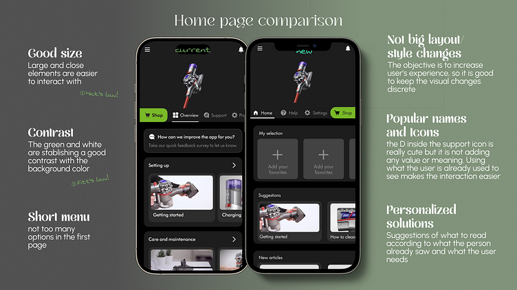
Let's start by the first page
This is what the user see after finishing the login and setup.
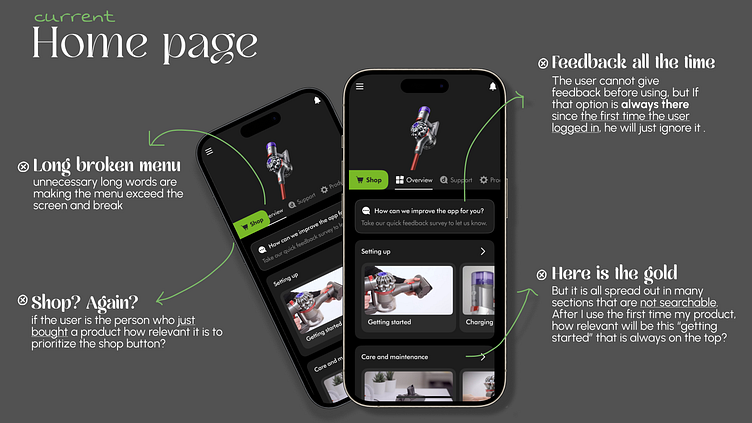
For me, this feedback so explicit in the first page shows that the enterprise is concerned with the user experience (maybe recently bad reviews, or the rating is falling) which is a good sign, but needs to be applied strategically to get a real feedback of the user who is indeed using the app.
Here is my suggestion:
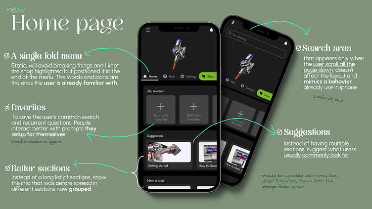
In the next image you can see them side by side. If you see the appearance design barely changed, because here I am not suggesting a more aesthetic app, but a more useful one. The good thing about this approach is that can be easily applied, and the user will not feel too impacted by the change when get in the new version for the first time.
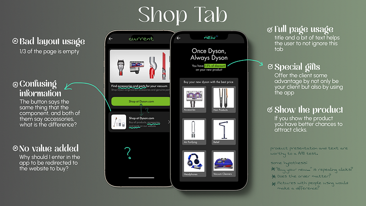
If we are keeping the shop tab, we should really use it. It is the button that calls the attention first, but the content is confusing. Here you can see my suggestion besides the old version.
Something recurring in this app is the excess of empty spaces, that are just there with no purpose, and even sometimes making the user experience more difficult. This is what happens with the instructions, lots of empty space and many actions to get access to the information.
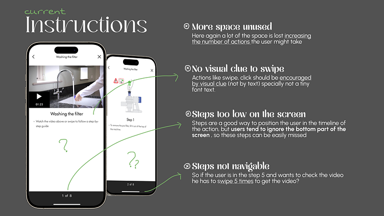
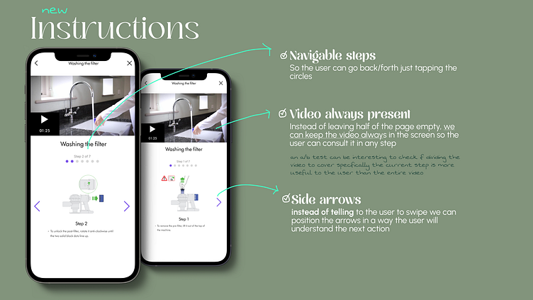
I myself felt lost here. I needed to know how to clean the filter, when I entered in the instruction, I just saw the page above with the video, the first thing I thought was: I would like to see this information written, or visual (I personally don't like video tutorials) the thing is that this information exists, but I took some seconds to see it was supposed to be swapped. After discovering another problem: I already knew how to remove the filter, the thing I needed to know was which products I can or can't use to clean it. But this information was just in the step 4. So I have to swap 4 times to go there. In a nut shell: Lots of empty spaces are just distancing the information from the user. Here is how I see it improved:
This was my biggest disappointment
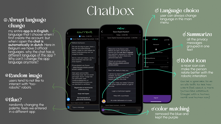
Chatbox is always my go-to choice. Written information for me is easier to search, to confirm and avoid communication misunderstood, specially in a country so multilingual as Belgium. So when I open the chat to check how it was I got surprised:
First: A lot of text all in a once
Second: All the text was in Dutch, but my app was configured in English
Third: The chat messages aren't organized and the communication tone is not conversational
I don't speak Dutch, and many of people here also don't. Many also don't speak French. So if the app is getting the language by the localization, that is already bad. But when I translated the messages I see that the message starts by:
saying hi and welcome to the chat and something like: if you still have questions one of our specialists will join the conversation
then unexpectedly privacy link
then a message saying that personal data are not required in the chat and the person should be aware of whom the data security.
then the option buttons
Does it sound for you like a conversation?
"hi, how are you? how can I help you? check this link and take care, there are many scams online trying to get your data. Login? Purchase help?"
For me it is pretty strange. I agree that it is important to remind the user of the privacy standards, but this can be done in a message BEFORE actually start offering help. Group the personal data warning with the privacy policy in one message makes more sense, and then start the conversation makes the transition to the action buttons natural.
But of course, it has to be done in the language the user chose. But in case the user changes his mind, this option should also be possible. Nowadays the 'my account' menu is not very useful, there are very few personalizations possible. So I would add there the language choice to be easier changed, if needed.
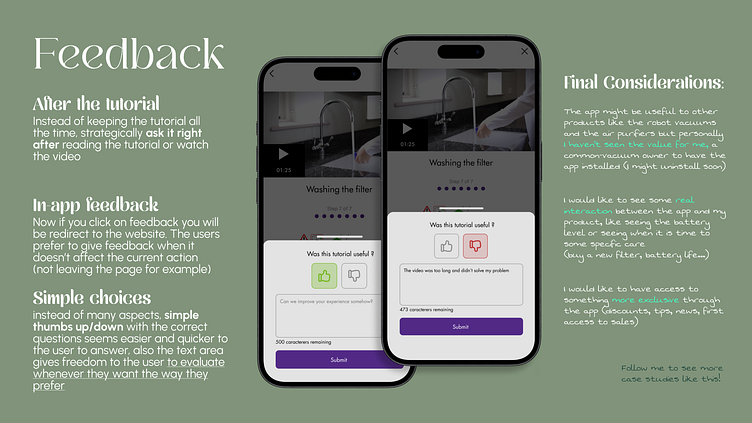
I haven't forget the user feedback, but let's think how people actually use the app: mainly for tutorials. If our goal is better educate the users to get the best from their products, it makes sense to evaluate how useful is the tutorial. The question should not be 'how do you feel about the app' or 'did you like this tutorial', once like or not something and the person's feelings are not the goal the app wants to achieve.
No one likes to be interrupted
But that is what that feedback in the home page was doing. The user opens the app most likely because some information is needed. If the user clicks in the banner to feedback, this click leads to the website page. The flow is interrupted, the user is no longer in the app.
Also, when I just open the app I have something to see there. Some instruction, some information. Asking the feedback before acting is pointless and the user will not feel the need of answering it. If the flow is: home page -> tutorial -> close the app maybe this user will never give feedback because it is just appearing before the actions.
If we shortly ask, right after an action, how easy, or how useful or did you get your question solved, probably the user will answer honestly. And it is important to give some visual clues that shows the user that the feedback is not an interruption. My strategy was :
feedback appearing like a drawer over the screen (not redirecting or using the entire page) to show the user that is part of the action.
only two questions, both optional, quick to answer
the text box is important because the user feel more inclined to give his opinion if we give the freedom to decide what to talk about and the way to do it. But at the same time many people are just satisfied and don't want to type anything. This user is more likely to click in the thumbs up button, which is a good metric (otherwise we have the risk of getting only the negative feedback)
It is not that hard to make your current app more user friendly. Actually, sometimes it can be simpler than you think.
Do you want to see what can be improved in your app? Hire me.
If you are learning UX, and like this content, follow me to see my future case studies.
