CODEPILOT - Design System
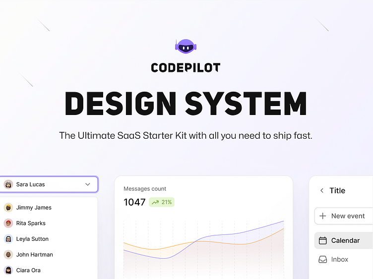
Design System
The CODEPILOT Design System is a comprehensive and cohesive framework designed to ensure consistency, efficiency, and scalability across all CODEPILOT interfaces. This system is tailored to support the needs of developers, enhancing their experience through a unified visual and interactive language.
Core Principles
Consistency: A uniform look and feel across all CODEPILOT interfaces to create a seamless user experience.
Efficiency: Streamline the design and development process with reusable components and clear guidelines, reducing time-to-market.
Scalability: Facilitate easy updates and expansions to the design system, accommodating future growth and innovation.
Accessibility: Ensure that all components meet accessibility standards, making CODEPILOT inclusive for all users.
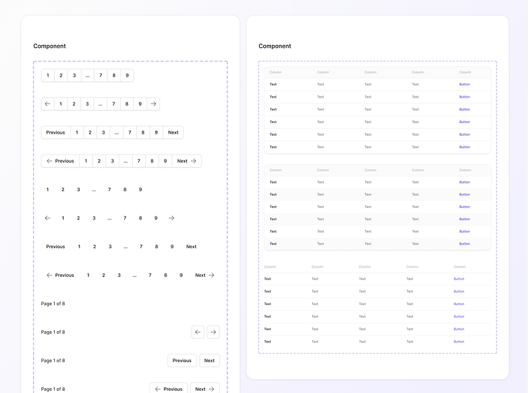
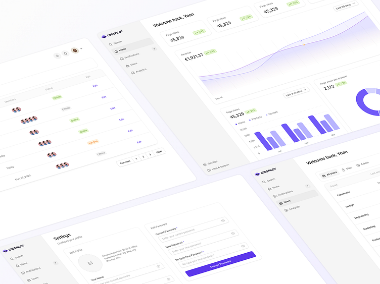
Navigation
Menus: Horizontal and vertical menus for site navigation.
Tabs: Tab components for organizing content within a single page.
Breadcrumbs: Navigation aids that show users their current location within the site.
Pagination: Controls for navigating through paginated content, with clear indicators for current page, previous, and next actions.

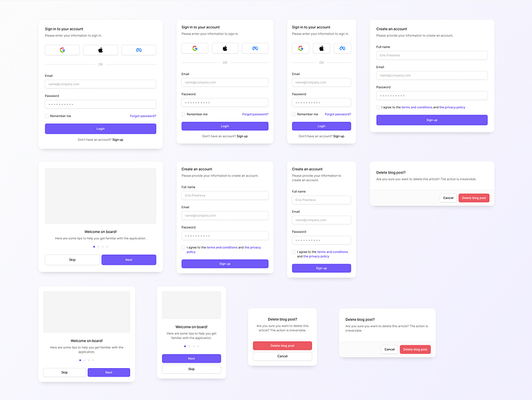
Forms:
Input Fields: Standard text inputs, password fields, email inputs, and more.
Select Menus: Dropdowns with customizable options and search functionality.
Checkboxes and Radio Buttons: Clear, clickable options for user selections.
Validation Messages: Inline and summary messages to guide users and correct errors.
Form Layouts: Structured layouts to ensure consistency and ease of use.
Layouts:
Grid System: A flexible, responsive grid system to structure pages and ensure alignment, supporting various screen sizes.
Spacing Guidelines: Consistent padding, margins, and spacing rules to maintain visual balance and prevent clutter.
Breakpoints: Defined screen size breakpoints to ensure responsive design across devices.
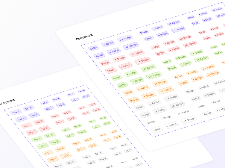
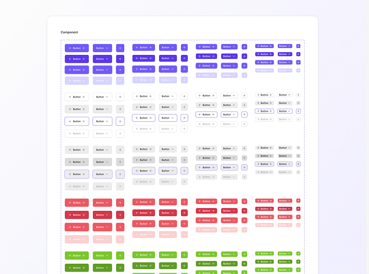
Buttons:
Styles: Various styles including primary, secondary, and tertiary buttons.
States: Defined states such as default, hover, active, and disabled for visual feedback.
Sizes: Multiple sizes (small, medium, large) to accommodate different use cases.
Visit www.codepilot.dev
Contact: enisp3@icloud.com