Innovative Accordion UI Design
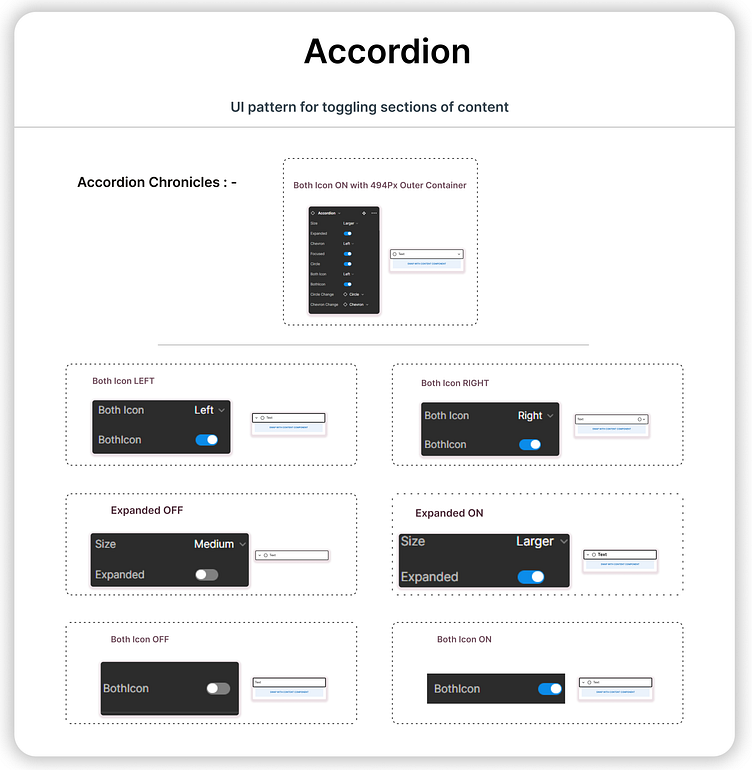
Dynamic Accordion UI Design
Description
Introducing our sleek and versatile Accordion UI pattern, designed to streamline the toggling of content sections in your projects. This comprehensive showcase demonstrates various configurations to fit different design needs. From icon positioning to expanded states, our accordion adapts to provide a seamless user experience.
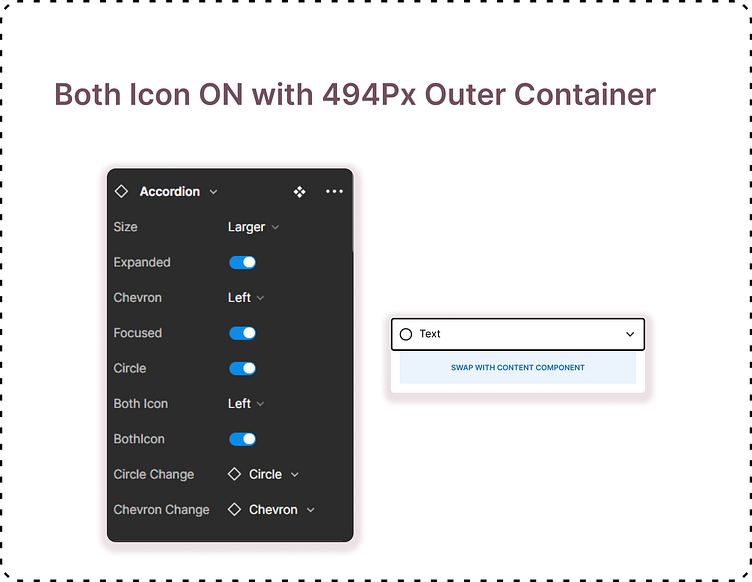
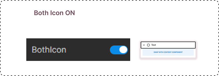
Both Icon ON with 494px Outer Container: Default view demonstrating the accordion with both icons enabled and positioned within a 494px container.
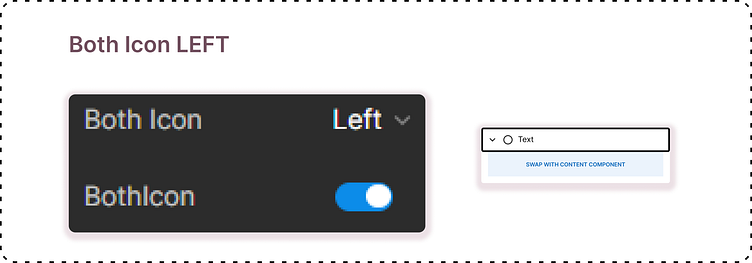
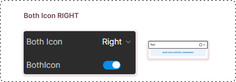
Icon Positioning: Easily switch between left and right icon placements for tailored navigation.
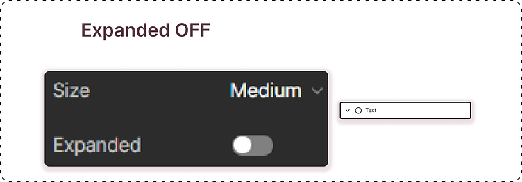
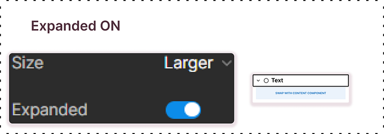
Expanded States: Toggle between expanded and collapsed views to enhance content visibility as required.
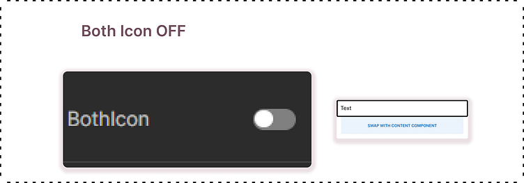
Customization: Flexible options for enabling or disabling icons to suit your design preferences.
Elevate your UI/UX design with this intuitive and customizable Accordion pattern. Perfect for dashboards, data displays, and any interface requiring organized content management.