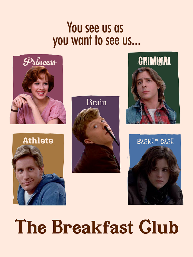
Breakfast Club Alternate Poster / Book Cover
I started this concept with a simple sketch and somewhat of a mock-up to get an idea of how I wanted the design to look like. I ended up keeping the jagged hand drawn boxes and somewhat poorly cropped photos to add to the imperfection the message of the movie was conveying.
I really did Brian dirty with his photo, but it still somehow fits.
In the end, I loved how it resembled a yearbook with everyone's photos and how they would sign their name.
Any comments or critiques are welcomed. I feel like the bottom could use more balance. Maybe the actors' names?
Thanks for looking.
More by Andrea Bermudez View profile
Like
