Book Cover Redesign - The Body Keeps The Score
My submission for the Book Design Club Challenge!
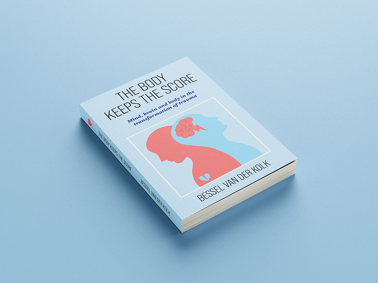
This book has a special meaning to me. So I was very excited to start this project. Getting in to this, I took my time to research the mental health field and I wanted to make sure this book is approachable for people that are going through a difficult period in their lives.
The light blue gives you a safe feeling and makes you feel secure. The contrasting pink shows tenderness and senssitivity in people that are going through burn out or despression.
As for the illustration. The mind is the strongest thing on earth in my opnion. So when there is chaos there, it will show in your whole body. The heart, our engine and central point in the chest, is first to go in these difficult times. For fonts I went with a strong sans serif font in all caps for the main title, again to represent a strong feeling. Followed by a elegant sans serif font for the sub header. The white border is a square and shows strength and and shines light. But also shows that people are often "Boxed in" and feel isolated when they go through this.
All that said, I just tried to resonate with as many people as I could while keeping it minimal. I wanted a clean design, no chaos. Thank you for reading this and I encourage you to read this book when you are feeling like the universe is against you. Warm greetings to all my fellow BYOL students!


