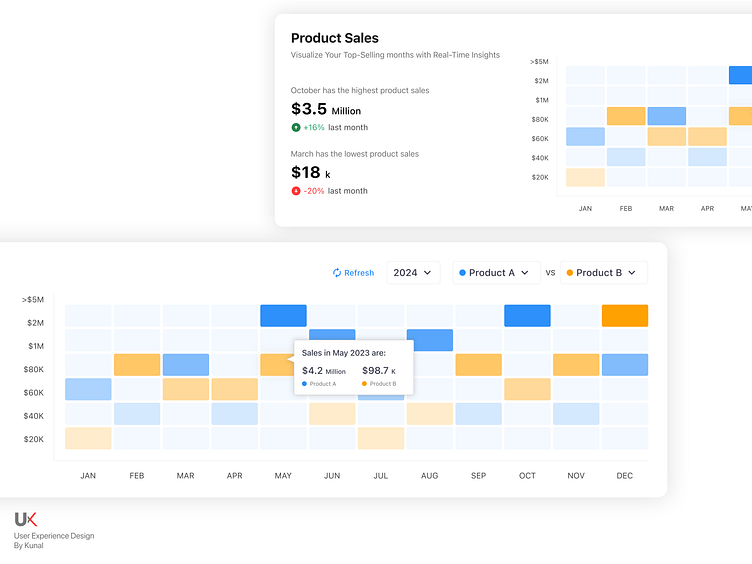
Heat Map Chart/Graph UI Design
📊 Product Sales Heat Map Design 📊
Hey Dribbblers! 🔥
Thrilled to share my new UI design for a Product Sales Heat Map! This visualization tool is crafted to help businesses effortlessly track and analyze sales performance across different regions.
🔹 Features:
Dynamic Color Gradients: Easily identify high and low sales areas with a clear, gradient-based color scheme.
Interactive Hover Effects: Gain instant insights by hovering over regions to view detailed sales data.
Customizable Data Layers: Toggle between various data sets, such as monthly, quarterly, and yearly sales.
Real-Time Updates: Stay up-to-date with live data synchronization, ensuring the most accurate and current sales information.
Detailed Tooltips: Get comprehensive information on sales figures, percentages, and trends for each region.
🎨Design Highlights:
Clean Layout: A minimalist design approach to ensure the data stands out and is easy to interpret.
User-Friendly Interface: Designed with the user in mind, focusing on ease of navigation and accessibility.
🔗 Let's Collaborate: I'm always open to feedback and collaboration. If you have any thoughts on this design or are interested in working together, feel free to reach out!
Available for HIRE!
Kunal Goyal
Let's Connect!! 💬 on LinkedIn

