🍽️ Tasty Station: Elevate Your Restaurant with Our POS System!
🎨 Stylish Visuals and Icons
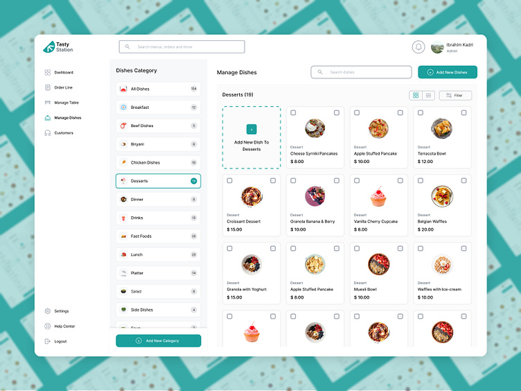
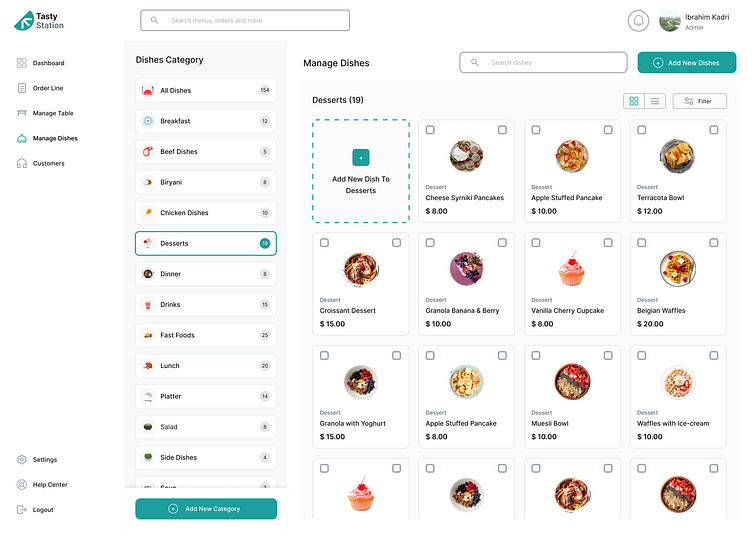
The Tasty Station restaurant POS system boasts a striking design with a blend of stroke and fill icons, exuding modernity and clarity. Rounded corners on every element add a friendly touch, enhancing user appeal and ease of understanding.
📐 Precision Alignment
Each element of the design is meticulously aligned, ensuring a polished and professional appearance. This meticulous attention to detail not only enhances usability but also elevates the overall user experience.
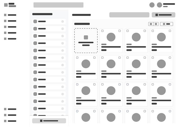
🖼️ Detailed High-Fidelity Wireframe
I meticulously crafted a high-fidelity wireframe as the foundation of the design. This detailed blueprint meticulously outlines each screen and interaction, laying the groundwork for a seamless and intuitive interface.
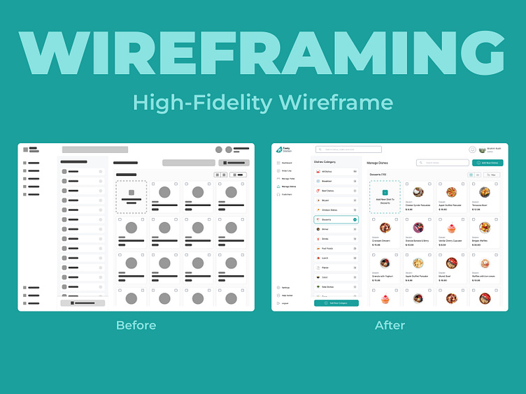
🔄 Seamless Wireframe-to-Design Transition
The high-fidelity wireframe served as a benchmark throughout the design process, ensuring that the final product faithfully represents the initial concept. This iterative approach guarantees coherence and functionality across all design elements.
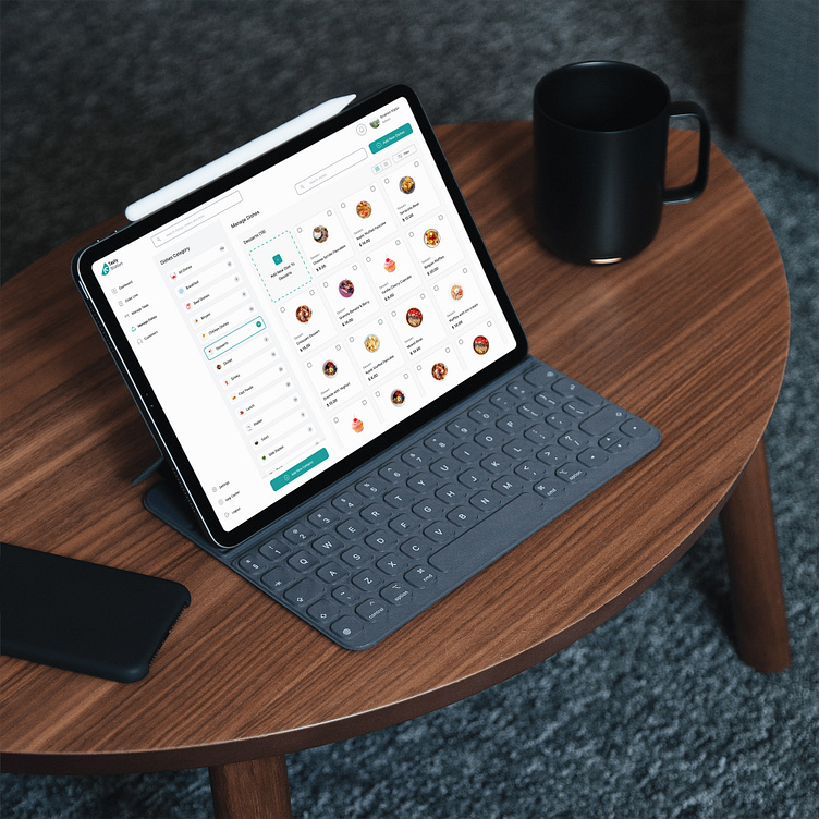
📱 Realistic iPad Mockup
To showcase the design in a real-world context, I utilized an iPad mockup. This realistic presentation allows stakeholders to envision how Tasty Station's POS system would appear and function in practical use, enhancing its appeal and usability.
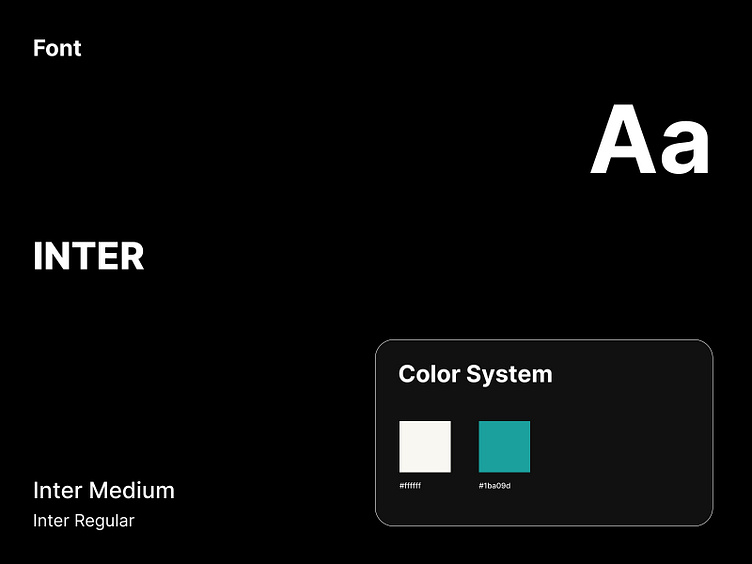
🎨 Vibrant Colors and Modern Fonts
Drawing inspiration from Eastern Blue and White, the design incorporates colors that resonate with professionalism and cleanliness, ideal for the restaurant industry. The font Inter was chosen for its modern aesthetic and exceptional readability, ensuring clear communication and visual harmony throughout the interface.
