Map Design
The Challenge
Day 029 of the 30-Day UI Challenge! The challenge was to create a Map Design. I spent about 2 hours on this.
What I Completed
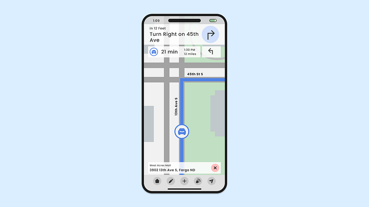
I made my dream Maps app. All the important information is located at the top, so my eyes don't have to go up and down the screen. The settings are located on the Navigation Bar so the map space isn't cluttered. I also like how I added the address at the bottom, in case I need to refer to it easily. There's a few times I've been driving to someone's house, not knowing their house number and the address was not easily accessible. This design allows a view of the address without taking up too much screen real estate.
There is so much more I could build out with this, but for now, I am happy with my design.
Reflection
This is my dream maps app, what do you think?


