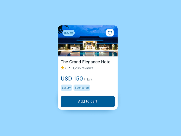
Daily UI Challenge #1 - Hotel Product Card
To enhance my UI skills, I've embarked on a journey to design small components daily. Inspired by Michał Malewicz's "Daily UI Challenge" from Hype4Academy, this project marks the first of many in my quest for continuous improvement.
Project Overview: For my initial project, I've created a hotel product card. A product card is a UI element that presents essential information about a product in a concise and visually appealing format. It typically includes details such as the product name, image, price, rating, and key features, facilitating quick and informed decision-making for users.
Hotel Card Description: My hotel card is designed to be part of a website that allows users to rate and review hotel prices for their vacation plans. The card includes:
Hotel Name: Clearly displayed at the top for easy identification.
Hotel Image: A high-quality image showcasing the hotel.
Price: The cost per night, prominently featured to aid in quick comparisons.
Rating: User-generated star ratings to provide insight into the hotel's quality.
Action Button: A call-to-action button for booking or viewing more details.
This hotel card aims to streamline the vacation planning process by providing all necessary information at a glance, ensuring a user-friendly and efficient experience.
