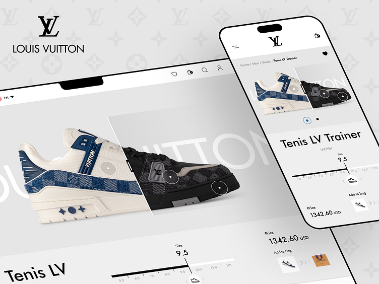
💻 website e-commerce LOUIS VUITTON
Hello friends! 🙌
We present the redesign of the Louis Vuitton website, designed to significantly improve the user experience, facilitating navigation and interaction with the page and optimizing each step of the purchasing process.
Colors and typography
For this redesign of the website I used the white, black and gray colors proposed in its branding 🎨, representing the elegance of its products in conjunction with its website, the typography that has been used for this proposal is legible and elegant which makes a very good combination with the interface elements.
Thanks!
Available for new projects Send me a email at sogaso.design@gmail.com
Follow me in Instagram: Angel Villanueva (sogaso)
Follow Orizon Design: Behance | Youtube | Twitter | www.orizon.co
More by Orizon: UI/UX Design Agency View profile
Like


