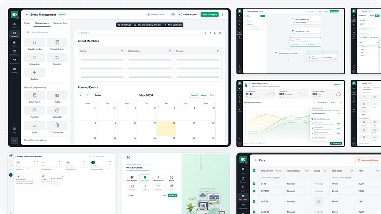
Redesign of Zero-Code Application Builder Platform
Client: Platform for creating applications without the need for programming skills. It provides users with a visual editor for web application development with support of data management, process automation, and the creation of web applications using pre-built components with the ability to use dynamic data. The main goal of the project is to make the process of creating applications as easy and accessible as possible.
Problem: According to feedback from users and the client, the platform's interface is inconvenient, outdated, and not organized, making it difficult to use and create applications.
Task: Conduct an audit of the current system, update the design of the interface, simplify system navigation, and expand features to improve the user experience.
Onboarding
The client provided feedback with detailed screenshots of the current system, describing the issues and suggestions for improvements. Along with the screenshots, user stories were shared to help understand the users' requirements and expectations.The main problems include the following:
It is unclear how to share access to the application with new users.
It is unclear how to add new components to the editing area and modify container layouts.
There are not enough analytics and statistics data about created apps on the Main Page.
First interaction with the system required guidance and help.
It is difficult to navigate automation settings and find the necessary options.
Data tables can contain a lot of information, but they have limited screen space, making it difficult to manage and find the data needed.
All provided information was studied and structured to define the tasks and estimate the project's cost. Additionally, an audit of the current pages was conducted to confirm the next steps for improvement with the client.
To approve the updated structure, a sitemap was created with a list of the main functionality for each section and a list of references for visualizing examples of solutions.
Based on the collected information, the scope of work was assessed, and a timeline with milestones was developed to effectively plan and track the project's progress.
Idea and Concept
At this stage, wireframes were created to visualize the proposed changes and improvements. Wireframes allow the client to see the updated interface's main elements and structure, including key navigation and component placement changes. This helped to approve all important aspects of the redesign and get valuable feedback before developing detailed UI concepts.
After wireframes approval, the next step is to create UI concepts. As a design system, it was chosen to use MUI with a Minimal UI template because the extensive experience of working with this library and the availability of ready components allowed to significantly reduce the time for design preparation and development.
UI Design
After several iterations and discussions of the design concept with the client, the creation of the user interface was started. The main idea of the design was to clearly separate the areas of content editing and the system interface, allowing users to focus on the necessary elements.Main modules of the final design:
Registration Flow
An onboarding process was added for better understanding of the user needs, suggest appropriate plans, and gather feedback for system improvement.
Home Page
The home page allows users to view key statistics of their workspace and applications. A "Getting Started" window was also added to help users take their first steps and familiarize themselves with all system modules.
App Builder
The main module of the system is designed to create web applications without coding using ready-made components.
During the work on the App Builder, many new features were updated and added, including:
The editing area is now clearly separated from the system interface.
Added a separate panel with dynamic data settings.
Replaced column layout customization with free editing of the width of each component section.
Added version management of the application to allow testing or updating functionality and publishing it to users.
Updated application page management to make it clearer and more intuitive.
Automations
The automations section allows users to create and manage triggers and actions to automate various processes within the system. The functionality was expanded by adding a visual representation of the automation map and new types of actions to simplify the creation and tracking of connections between components.
Data Tables
The data tables section allows users to manage the data used in applications. Since tables can contain large data, the interface was adapted to utilize the maximum screen width. More flexible table management was added: column dragging and resizing, filtering, and additional data information.
User Management & Roles
The user management system was completely redesigned. Users are now divided into different roles to distinguish between administrators, editors, and end users. Each role has separate settings for permissions and attributes.
User Access
The User Access system allows end users to interact with created applications.
Preparation for Development
Despite using a ready-made design system during development, all completed screens undergo additional review before being handed over to the developers. This is necessary to ensure that all components comply with the MUI documentation, do not use custom elements, and can be conveniently viewed through the dev mode in Figma.
Scope of Work
During 26 days of work on the project was provided:
Identified the main problems
Conducted an audit and research
Created wireframes and UI concepts
Completely redesigned the system interface
As a result, onboarding provides a clear first interaction with the platform and guides through core features. Users can effortlessly customize their applications with the help of an updated app editor area, dynamic data, and visual builder of automations. Data tables now perfectly accommodate a large amount of information, and navigation throughout the system has become intuitive and straightforward.
The number of hours spent on the project fully corresponded to the timeline and planned milestones, so the client received the completed design exactly on time.


