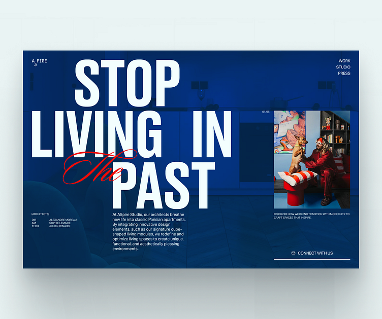
Editorial Architectural Designs for A5PIRE Studio
For this week's editorial design explorations,
I drew inspiration from the bold and brilliant Anthony Authie from Zyva Studio. They’re not afraid to push boundaries with extravagant designs and a vivid use of colors, and that really sparked something for me. I tried to capture that fearless spirit in a website design that complements their architectural style without stealing the spotlight.
I think I found some balance 😅 but I'm curious, what do you think about using bold colors in design when the content is already "loud"?
P.S. A quick note while we’re talking about websites: don’t overlook your 404 page! It might not be the star of the show, but it sure keeps the user experience smooth.
More by Quentin Caron View profile
Like


