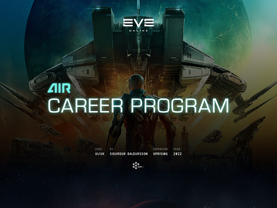
EVE Online - UI/UX Case (Part2)
The final result was an iteration on the circular layout, allowing players to navigate between Careers, Activities, and Objectives. With the amount of content and information that we wanted to present in a digestible way, we opted for having each layer separate from each other.
Hence, seamless navigation back and forth was essential, with a futuristic touch, as depicted in the animation in the below
(You can view the original full post on Behance)
More by Siggi Baldursson View profile
Like


