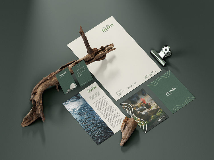
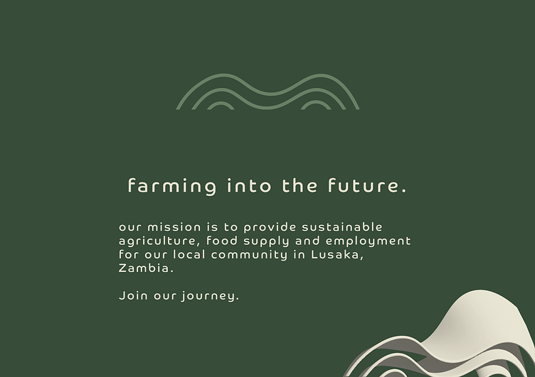
Brand Identity - Munda Farms
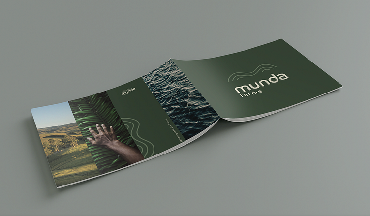

This strong brand identity was created for Munda Farms - an aqua and agriculture farm in Zambia. The client requested a clean, bold brand identity that speaks to the locality of the farm and maintains its authenticity.
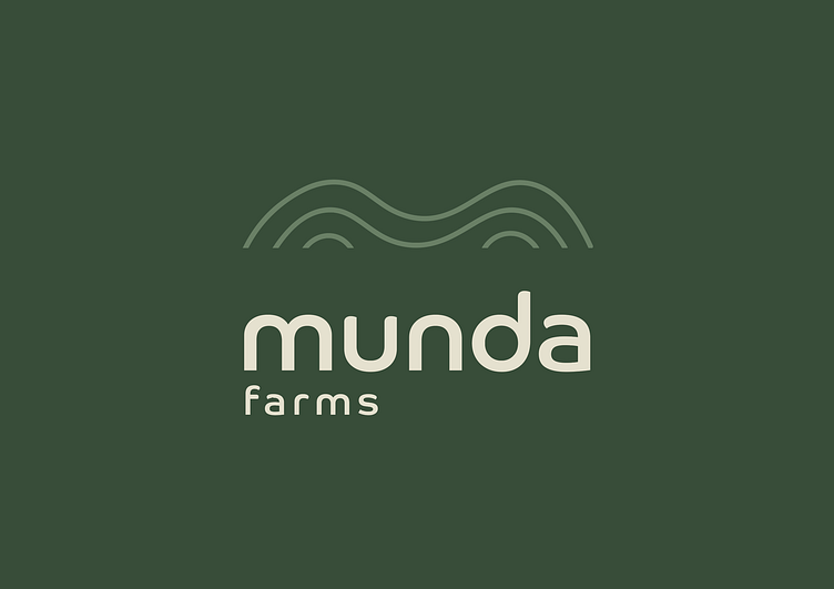
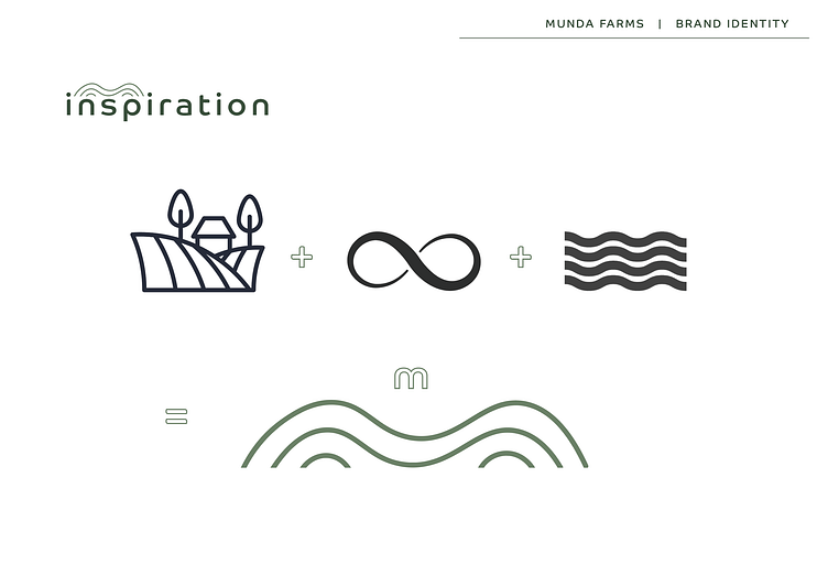
The word Munda is translated to mean 'field' or 'garden' in the Nyanja language spoken in Zambia, so it was important to keep the elements of fields and the feeling of freedom and abundance close to the brand's voice.
The wavy 'M' shape houses various connotations directly linked to the farm, representing: the continuity of the farm and its support to its surrounding community; the ebb and flow of a farming season including the ploughing of the land and its irrigation, and the terrain of the farm and planting beds.