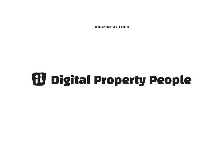
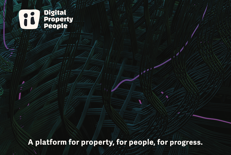
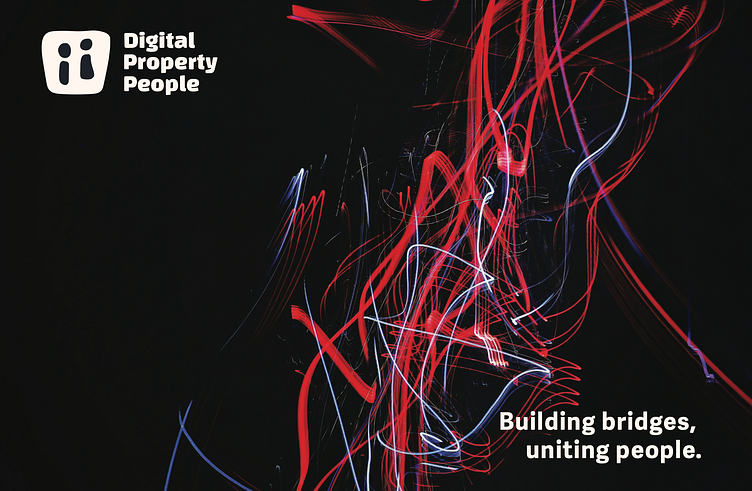
Brand Identity - Digital Property People
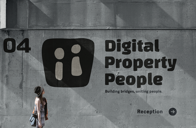
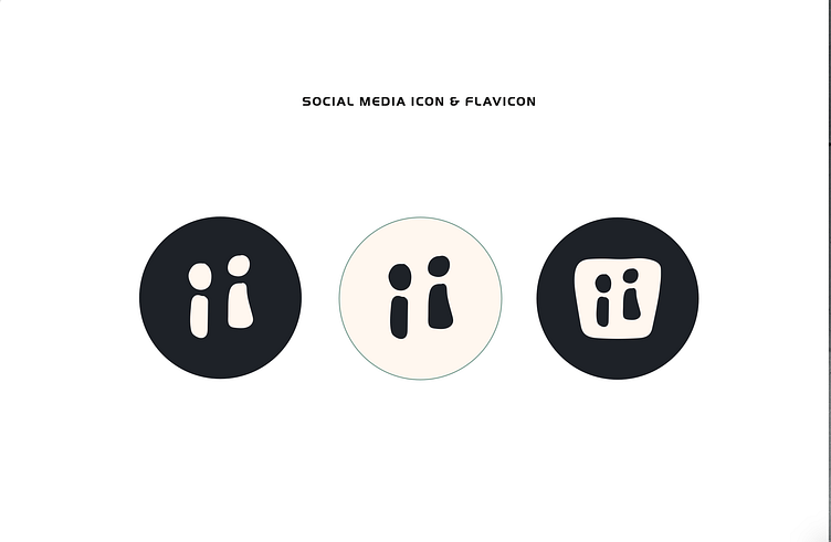
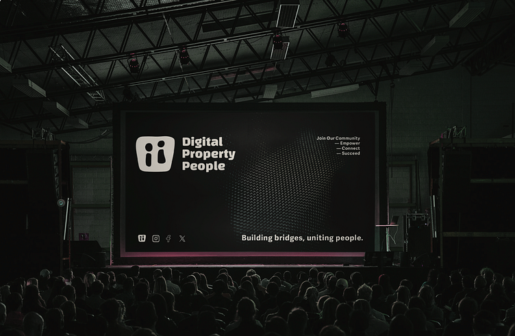
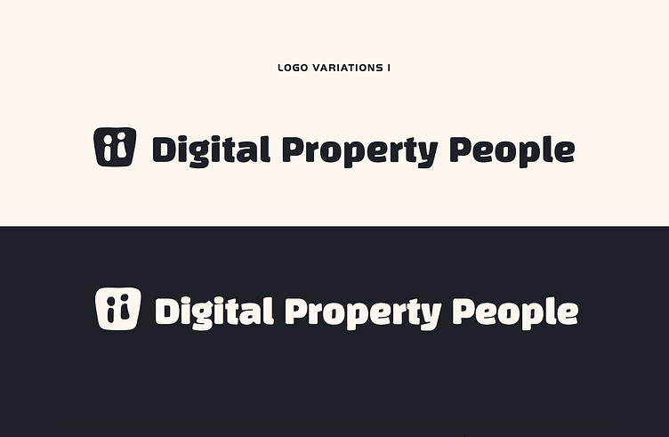
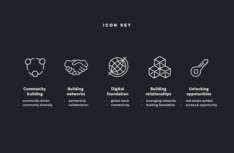
This client was looking for a bold, totally unique brand identity that would stand out in the tech market- moving away from the sharp, AI-driven, impersonal brand designs. With this in mind, I developed a bold logo with personal, hand-drawn elements in line with the heavily community-driven brand ethos- also represented by the two abstract icons at the centre of the logo symbol.
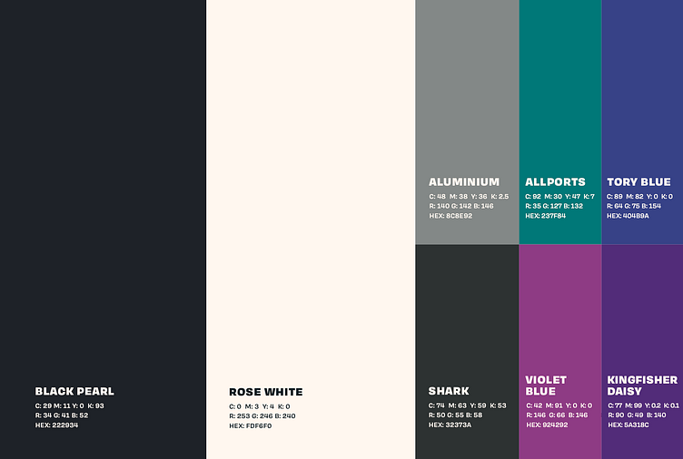
A charcoal tone was paired with an off-white tone to move away from stark black and white brand identities, promoting inclusivity and an open interaction with potential clients and members.