Agency studio
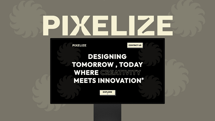
1. Home Page
Design Element:
Background: Black with subtle flower-like patterns positioned at the four corners.
Typography: The text is in a bold, modern sans-serif font. The main message is emphasized with varying font weights and sizes.
Color Scheme: Predominantly black and white, with hints of a light beige color in buttons and text.
Key Components:
Logo: Located at the top left, the logo “PIXELIZE” is simple, enhancing brand recognition.
Main Message: The tagline “DESIGNING TOMORROW, TODAY WHERE CREATIVITY MEETS INNOVATION” is centered, clearly conveying the company’s vision.
Call-to-Action (CTA): Two buttons, “CONTACT US” in the top right and “EXPLORE” at the bottom center, prompt user engagement and exploration of the website.
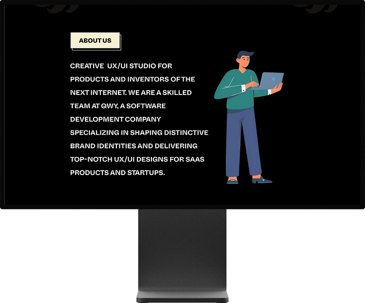
About Us Page
Design Element:
Background: Maintains the consistent black theme with minimalist styling.
Typography: White, bold, and clean text providing high contrast against the dark background for readability.
Illustration: A character illustration of a person holding a laptop adds a touch of friendliness and approachability.
Key Components:
Section Header: “ABOUT US” is prominently displayed in a beige button-like box, guiding the user to the section’s purpose.
Description: A detailed paragraph explains the company's focus on UX/UI design for products and startups, emphasizing creativity and innovation.
Illustration: Positioned to the right, it complements the textual content, making the page visually engaging.
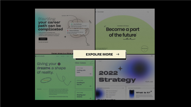
Portfolio/Projects Page
Design Element:
Background: Continuation of the black theme to maintain brand consistency.
Images: Four blurred preview images representing different projects or case studies, offering a sneak peek into the company’s work.
Typography: Clear and bold text for the “EXPLORE MORE” button, inviting users to dive deeper into the projects.
Key Components:
Visuals: The blurred project previews create intrigue, encouraging users to click and view more detailed information.
Call-to-Action (CTA): The centrally placed “EXPLORE MORE” button in a light beige shade stands out, driving user engagement to explore further into the portfolio.

General Design Consistency
Color Scheme: A consistent use of black as the primary background color, paired with white and beige for text and buttons, creating a sleek and modern look.
Typography: Bold, clear, and legible, designed to grab attention and convey information effectively.
User Experience (UX): Clear CTAs and structured content guide the user through the site seamlessly, promoting interaction and exploration.
Visual Appeal: The use of large, engaging text and strategically placed illustrations and images enhances the visual appeal, making the site inviting and professional.
Suggestions for Portfolio Description:
When presenting these designs in your portfolio, you might want to highlight the following aspects:
Vision and Branding: Explain how the design reflects the company’s vision of combining creativity with innovation.
User Engagement: Emphasize the strategic placement of CTAs to guide user interaction.
Visual Hierarchy: Describe the thoughtful use of typography and layout to prioritize information and maintain clarity.
Consistency: Point out the consistent color scheme and design elements across different pages to strengthen brand identity.
User Experience: Discuss how the design ensures a smooth and intuitive user journey, from landing on the homepage to exploring projects.
