Landing Page Redesign for Medical Professionals
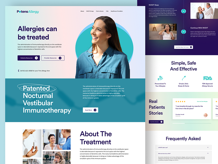
The project involved redesigning the landing page for a medical professional specializing in allergy control treatments. The primary objective was to create a user-friendly, intuitive, and visually appealing interface that effectively communicated the client’s expertise and services.
The design featured a clean, professional layout with a clear call-to-action, ensuring visitors could easily understand the treatments offered and how to schedule a consultation. The color scheme and typography were chosen to evoke a sense of trust and professionalism.
Interactive elements, such as hover effects and smooth scrolling, were incorporated to enhance user engagement. The page was also fully responsive, ensuring a seamless experience across all devices.
The project followed a user-centered design approach, involving user research, wireframing, prototyping, and user testing to ensure the final design met the needs and expectations of the target audience. The ultimate aim was to create a landing page that not only looked great but also drove conversions and helped the medical professional effectively reach their target audience. The project was successfully completed, delivering a landing page that was well-received by both the client and its patients.
I've focused on creating a visual identity that conveys safety, reliability, and customer care. The branding elements are designed to be cohesive across all platforms and making it instantly recognizable. My goal was to build a brand that not only looks great but also instills confidence in the users.
Let me know if we want to work together:


