Brand Identity and Logo Design for Reverse Smoked Products Inc.
Brand Identity and Logo Design for Reverse Smoked Products Inc.
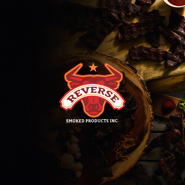
At the heart of Reverse Smoked Products Inc. lies a bold new logo that powerfully communicates the brand's rugged and authentic character. We’ve crafted a design that not only captures the essence of smoked meat products but also establishes a strong visual presence in the market.
Key Design Elements:
Vivid Symbolism:
Bull Iconography: Central to the logo is a striking bull head, symbolizing strength, quality, and the hearty nature of the brand’s smoked meats. The bold lines and detailed features of the bull convey the robust and intense flavors that Reverse Smoked Products Inc. stands for.
Star Motif: Positioned above the bull, the star signifies excellence and high standards in smoked meat production. It adds an element of prestige and reinforces the brand’s commitment to delivering top-tier products.
Typography:
Dynamic Lettering: The brand name "Reverse" is presented in a bold, arched font that complements the bull’s dynamic stance. This typographic style reflects the brand’s confident and forward-thinking approach.
Subtext: "Smoked Products Inc." is subtly integrated beneath the main logo, using a clean, professional typeface to balance the overall design and provide clarity on the product category.
Color Palette:
Rich Reds and Oranges: The warm, earthy tones echo the natural color of smoked meats, evoking a sense of warmth, richness, and appetite appeal. These hues are strategically chosen to create a strong visual impact and align with the brand’s flavor profile.
Contrasting Whites: The white banner with the brand name enhances readability and adds a crisp contrast to the logo, making it stand out against dark backgrounds often used in packaging and marketing materials.
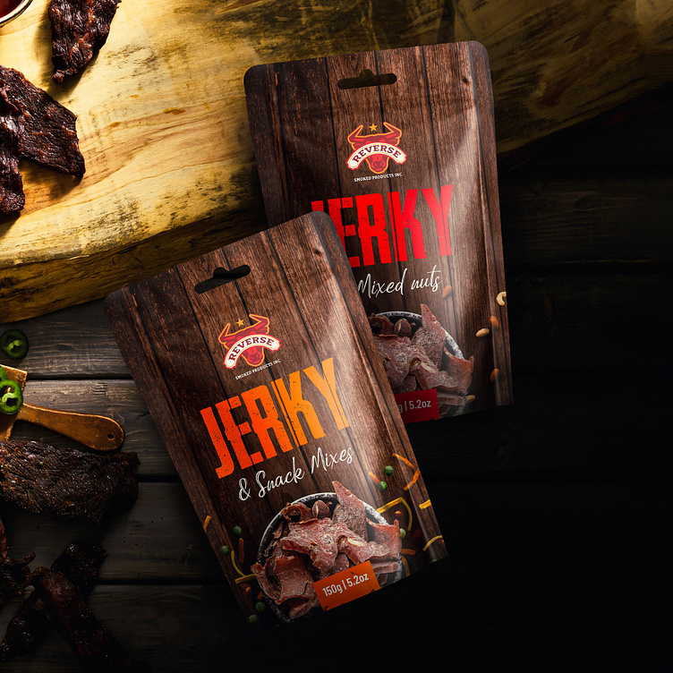
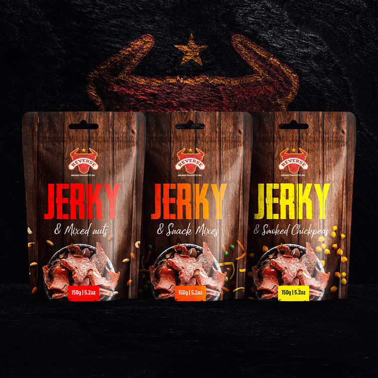
Packaging Design:
Our packaging design for Reverse Smoked Products Inc. translates the brand’s visual identity into a tangible experience that appeals to both the eye and the appetite.
Visual Appeal:
Woodgrain Texture: Incorporating woodgrain textures on the packaging ties into the traditional smoking methods and enhances the rustic, artisanal feel of the product.
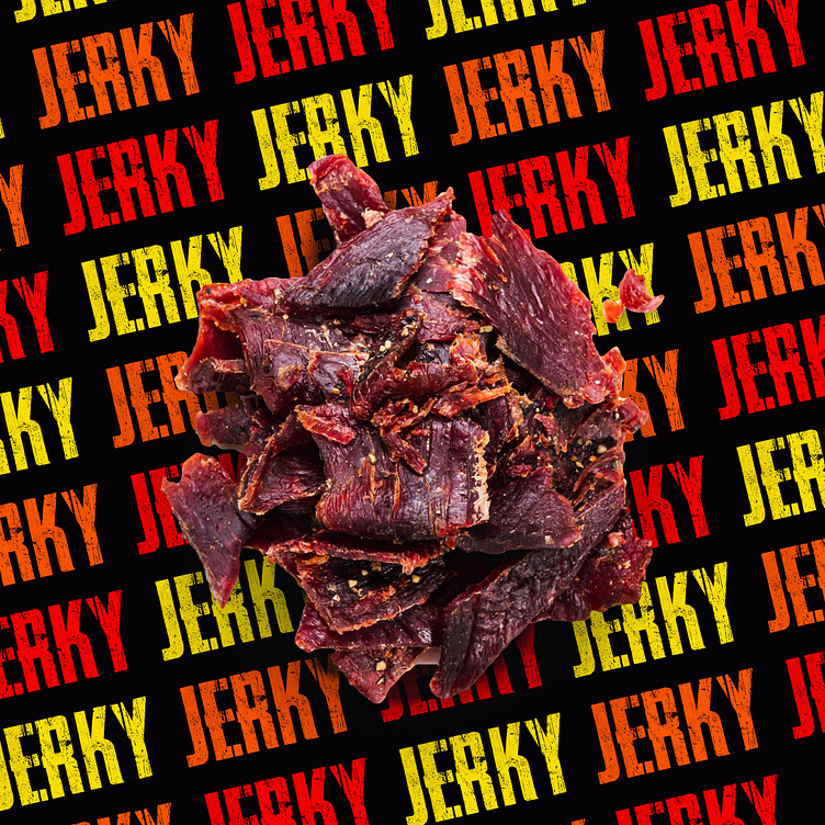
High-Resolution Imagery: Mouth-watering images of smoked meat slices are showcased prominently, tempting consumers and giving a sneak peek of the product’s quality.
Functional Design:
Durability: The packaging is designed to protect the integrity and freshness of the smoked meats, ensuring they reach consumers in optimal condition.
Convenience: Features such as resealable options and clear labeling provide a user-friendly experience, catering to the convenience sought by today’s consumers.
Informative Layout:
Nutritional Information: Clear and accessible placement of nutritional facts and ingredient lists ensures transparency and aids informed purchasing decisions.
Brand Messaging: Engaging descriptions and backstory elements connect with consumers on a personal level, reinforcing brand loyalty and trust.
Conclusion:
The logo and packaging design for Reverse Smoked Products Inc. encapsulate the essence of the brand—bold, flavorful, and uncompromising in quality. Our design approach ensures that the visual identity not only stands out on the shelf but also resonates deeply with the target audience, reflecting the brand’s dedication to delivering the finest smoked meat products.