Foodservice
Fullhouse Foodservice - Rebranded Landing Page Design 🍊
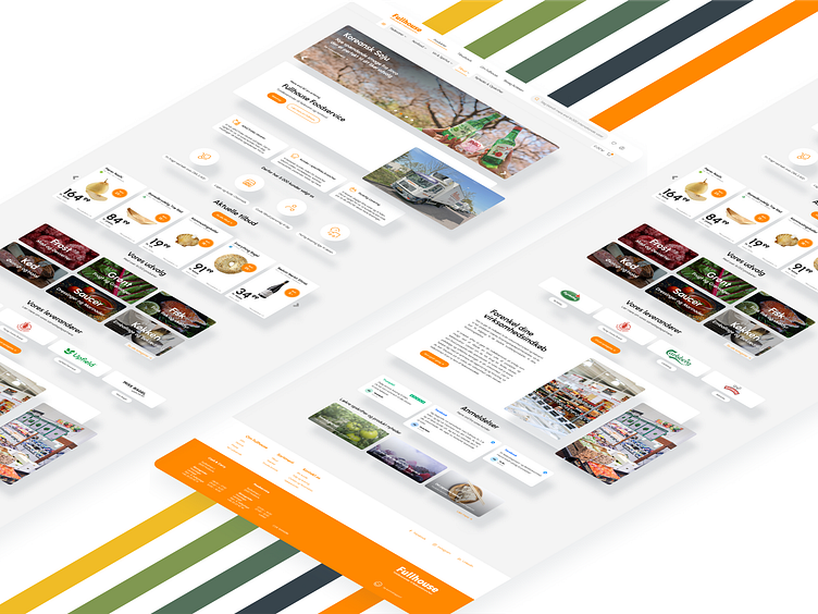
Super excited to unveil the fresh, new look for Fullhouse Foodservice's landing page! This redesign brings a modern, professional face to our company, reflecting our longstanding values since our inception in 1983.
Key Features:
Clean and Intuitive Layout: Easy navigation to ensure a seamless user experience.
Vibrant Imagery: High-quality visuals that showcase the fresh, premium groceries we supply.
Heritage and Trust: A dedicated section that highlights our rich history and commitment to quality service.
Responsive Design: Optimized for all devices, ensuring accessibility and convenience for our users.
The goal was to create a design that not only looks great but also reinforces Fullhouse Foodservice's dedication to providing top-notch groceries to restaurants across Copenhagen. This new look is sure to build trust and excellence in every interaction.
Check out the full design and share your thoughts! Your feedback is always appreciated. 🌻

