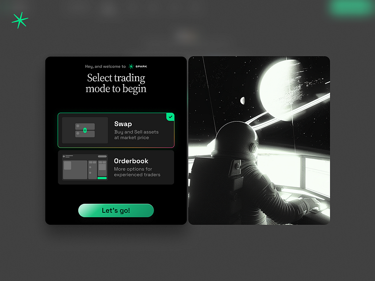
Splash screen UI for sprk.fi
The splash screen. Image can blur the focus, when you need to decide which UI to use, but it adds some emotion and mood for user's first experience with the product. It should be about invitation, not about dealing with hard choice (despite the fact that it really is so)
More by Alexander Lygin View profile
Like
